Spellbound ceremonies
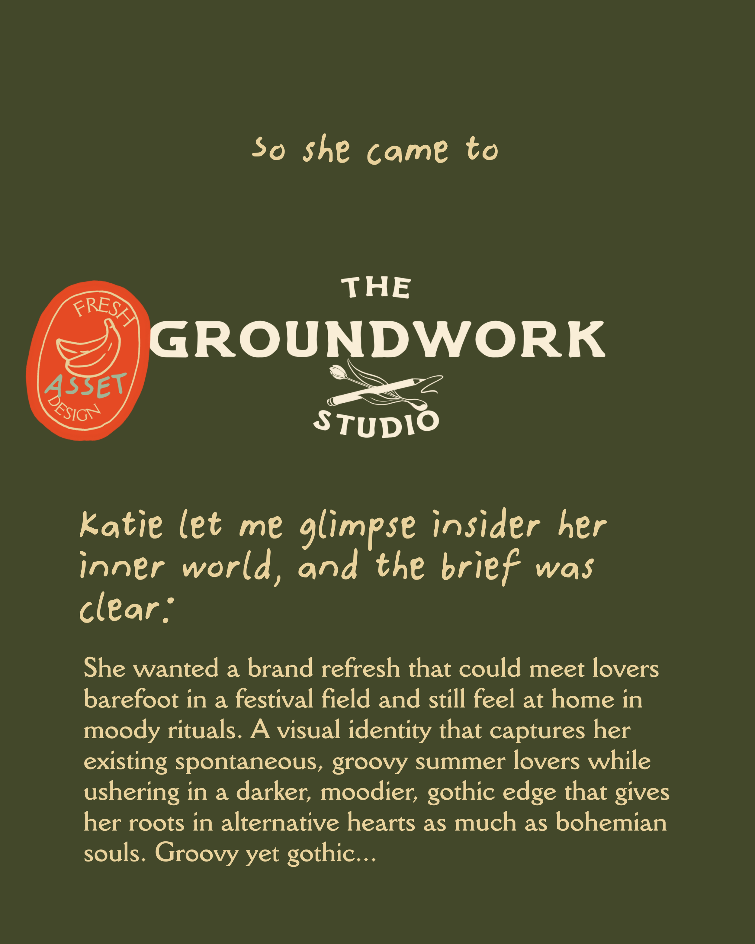
Katie wanted a brand refresh that could meet lovers barefoot in a festival field and still feel at home in moody rituals. A visual identity that captures her existing spontaneous, groovy summer lovers while ushering in a darker, moodier, gothic edge that gives her roots in alternative hearts as much as bohemian souls. Groovy yet gothic...
Package: The Prune.
Purple and orange echo both the celestial and the gothic. Keeping her signature palette and font, I deepened the purples into something richer and otherworldly, while warming the oranges into earthy tones that ground the magic.
Scroll to see from brief to brand…
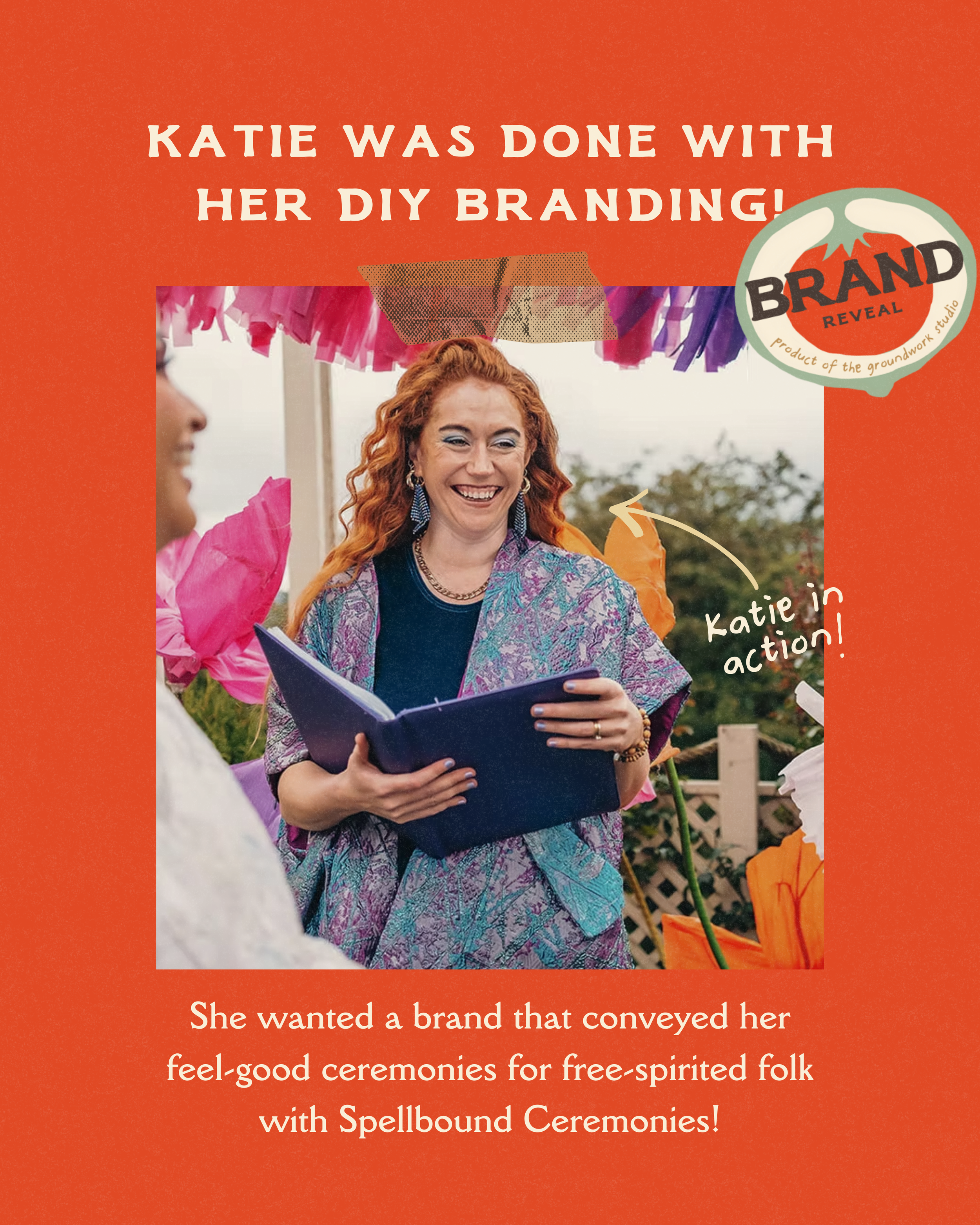
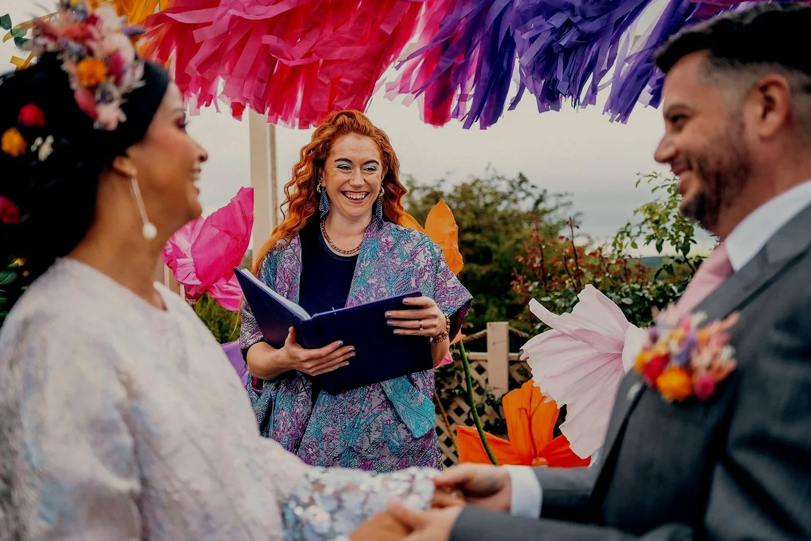
A woman with curly red hair, wearing a colorful jacket and earrings, is reading a book at an outdoor event decorated with pink, purple, and orange tissue paper, with trees and a fence in the background.
A green background with beige and white text, including a red badge with a banana illustration and the words "FRESH ASSET DESIGN", and a logo with a paintbrush, a needle and thread, and the words "GROUNDWORK STUDIO".
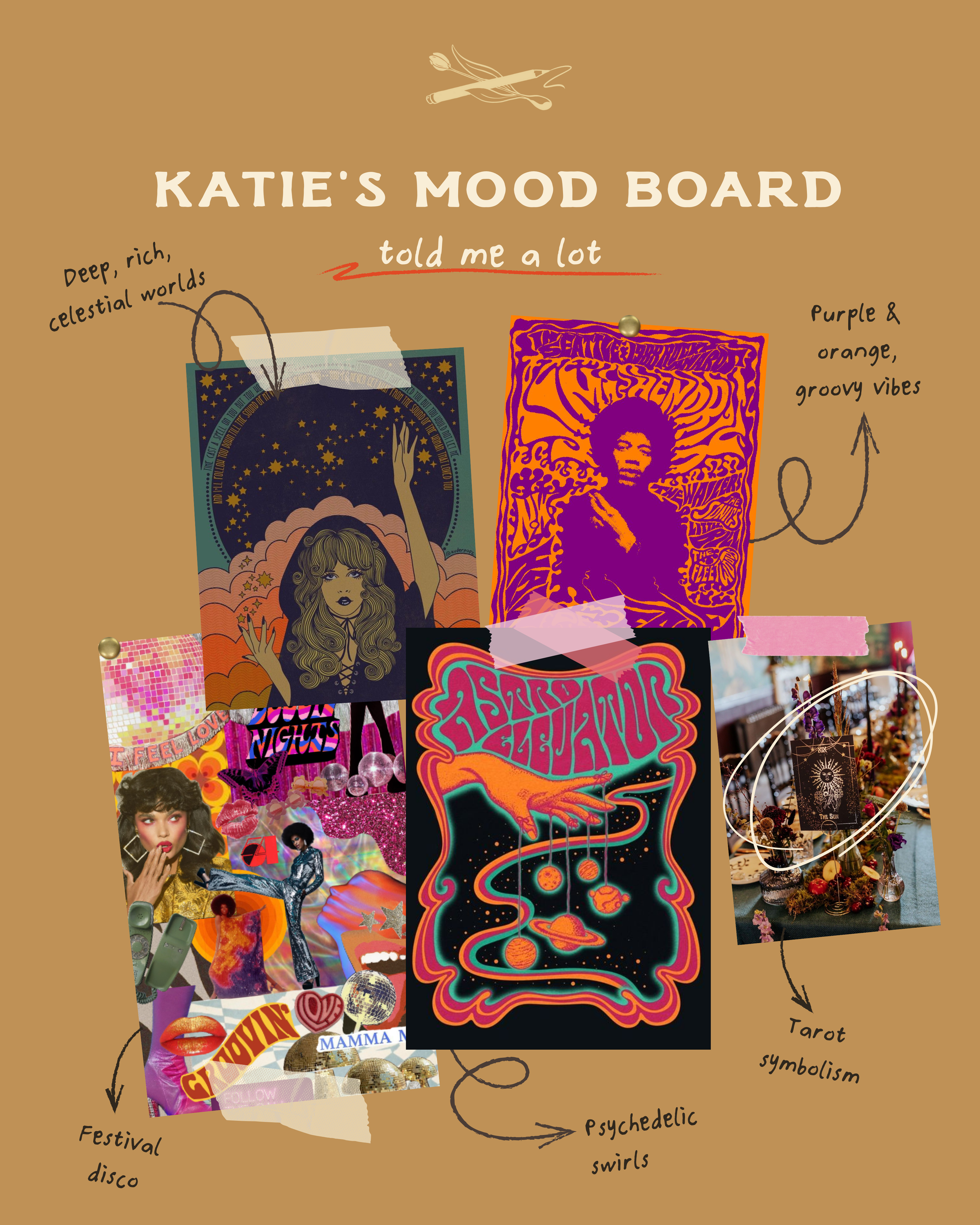
A mood board titled "Katie's Mood Board" with artistic, psychedelic, celestial, and festive images. Handwritten notes point to different sections, describing themes like "Deep, rich, celestial worlds," "Purple & orange, groovy vibes," "Psychedelic swirls," "Festival disco," and "Tarot symbolism." The board includes colorful, psychedelic illustrations, photos, and collage elements.
A smiling woman with short dark hair, wearing a patterned sweater, sitting on the floor with her hand resting on her face. There is wall art in the background and a piece of furniture partially visible.
Black and white photograph of a woman with short dark hair, wearing a patterned sweater and necklace, smiling and looking off to the side. The background includes a desk with a tablet or laptop and a sign that reads "YES SO I CAN BUT".
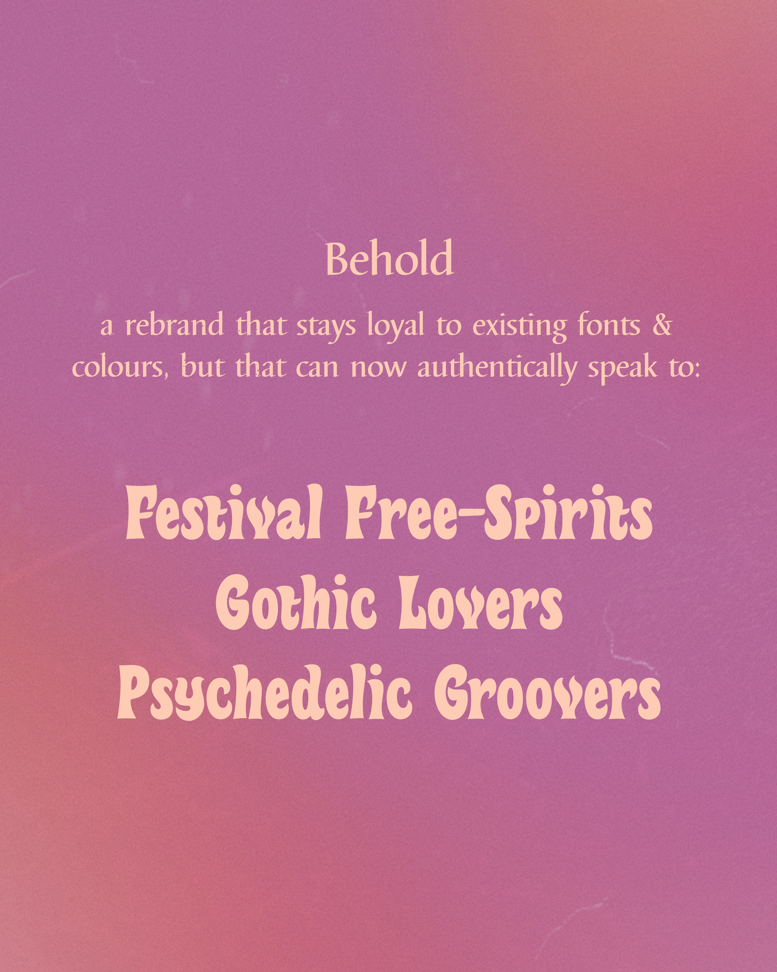
Purple background with text promoting festivals and groups including Behold, Festival Free-Spirits, Gothic Lovers, Psychedelic Groovers.
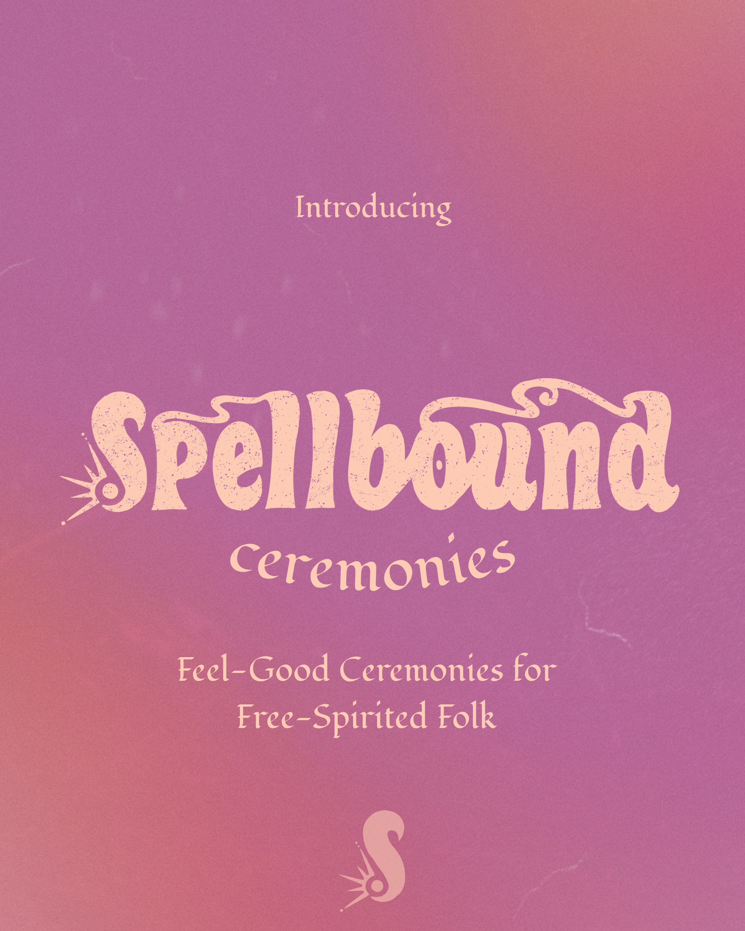
Purple gradient background with pink text that says "Introducing Ceremonies" and smaller white text that reads "Feel-Good Ceremonies for Free-Spirited Folk" with a stylized swan logo at the bottom.
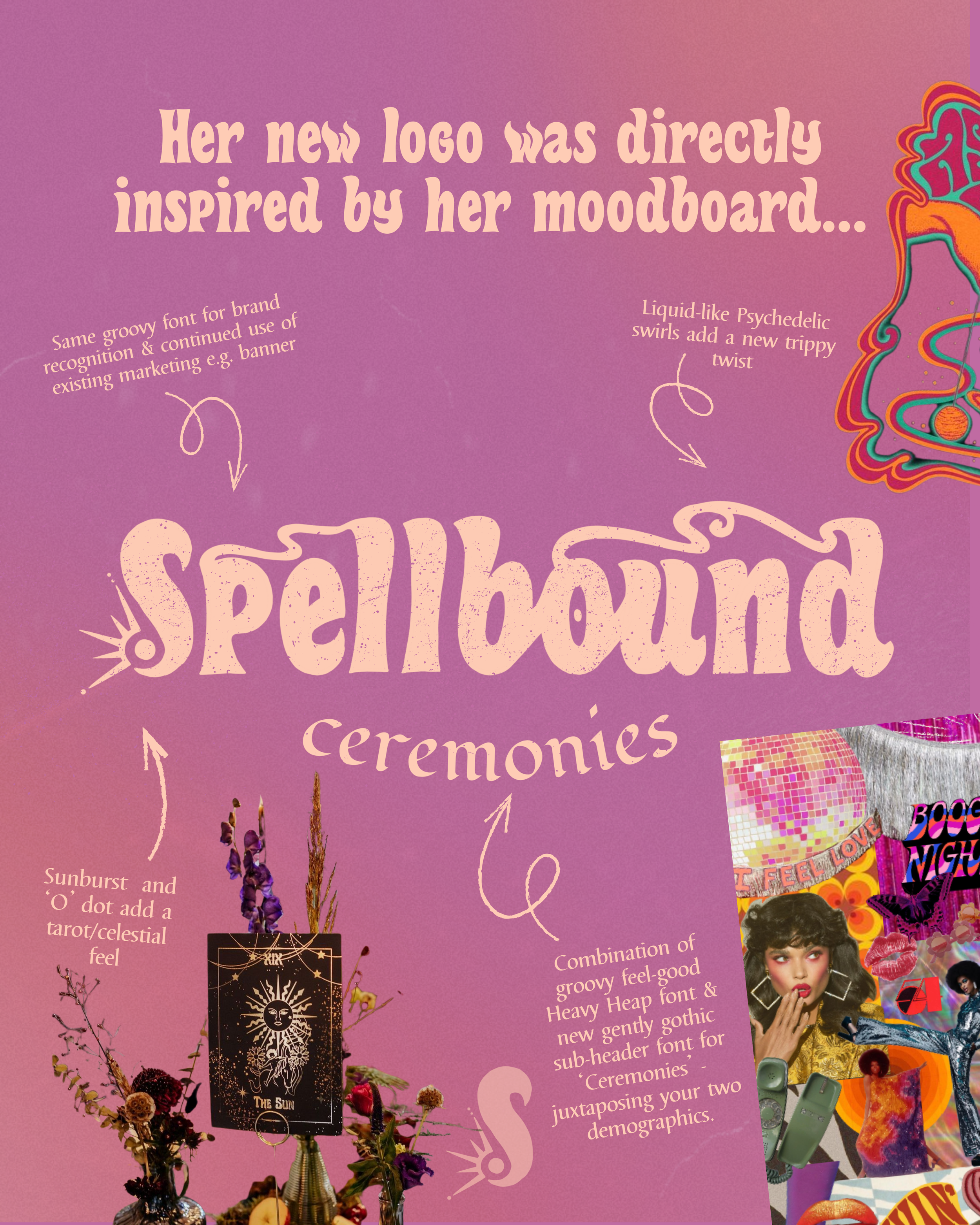
A collage of colorful, vintage-style ceramony posters and a woman with short dark hair, holding a microphone and wearing a gold dress. The background is purple with white and pink text and decorative arrows.
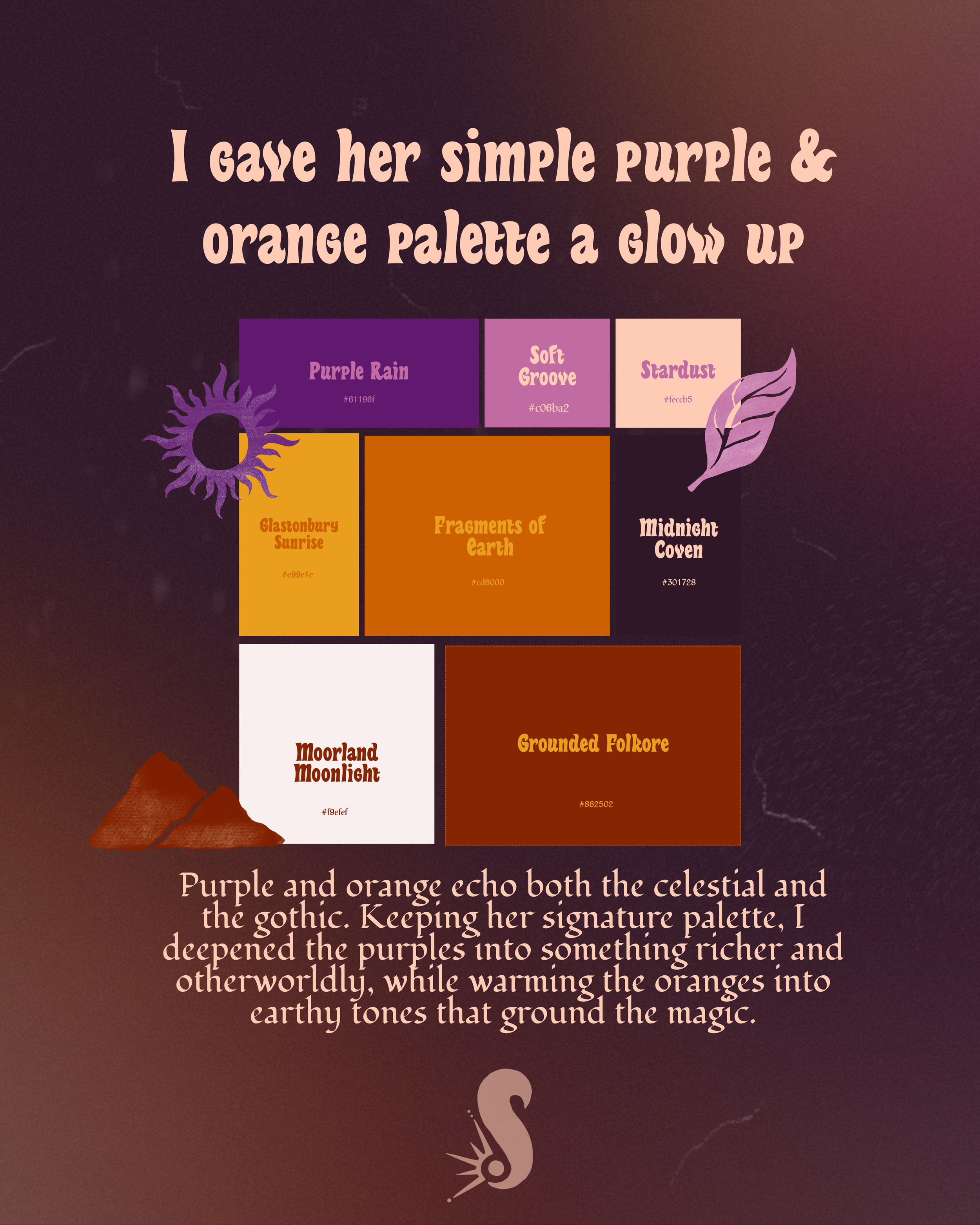
A collection of color swatches with names and hex codes, including Purple Rain, Soft Groove, Stardust, Glastonbury Sunrise, Fragments of Earth, and Midnight Coven, displayed over a dark gradient background with decorative illustrations of a purple sun and a purple leaf.
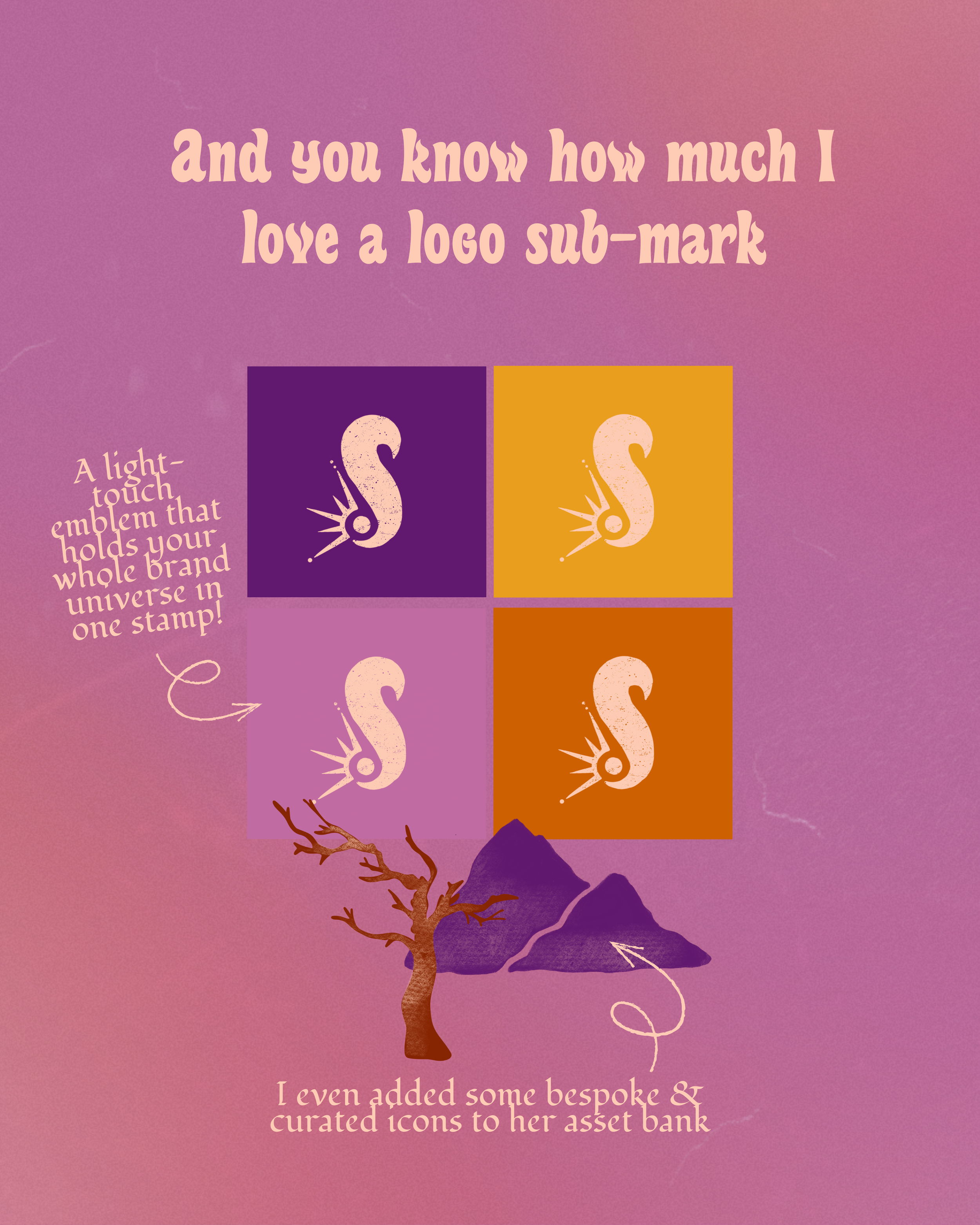
A colorful graphic featuring the quote "and you know how much I love a logo sub-mark" in pink text on a gradient purple and pink background. Below, there are four logo icons of a seahorse in purple, mustard yellow, brown, and orange, with a pink description on the left side that mentions adding bespoke and curated icons to an asset bank. The background also includes a stylized mountain and tree illustration at the bottom.
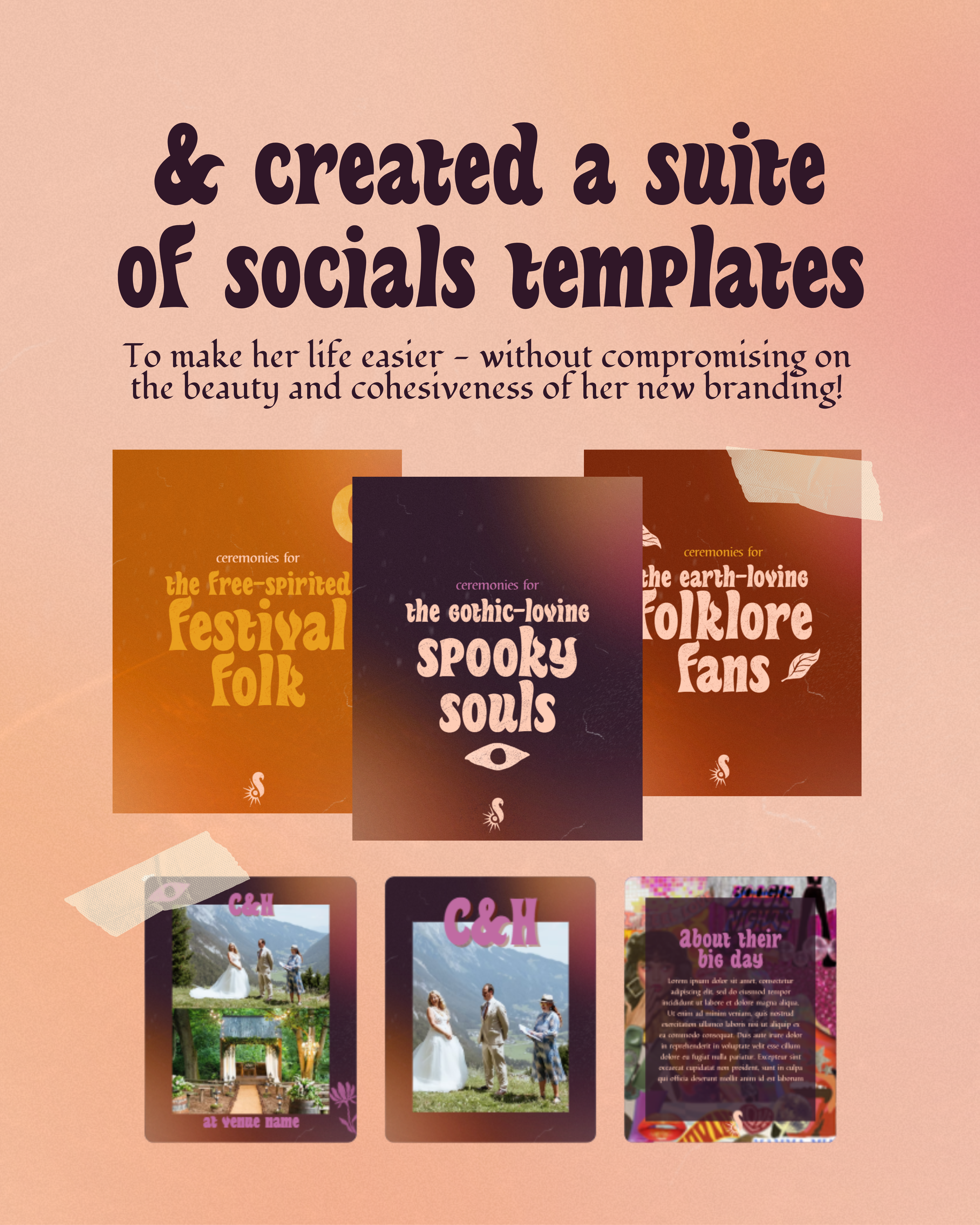
Close-up of a website or social media platform displaying various social templates. The prominent header reads, '& created a suite of socials templates', with a subheading about making life easier while maintaining branding. Below, there are several colorful thumbnail images of different social media templates.
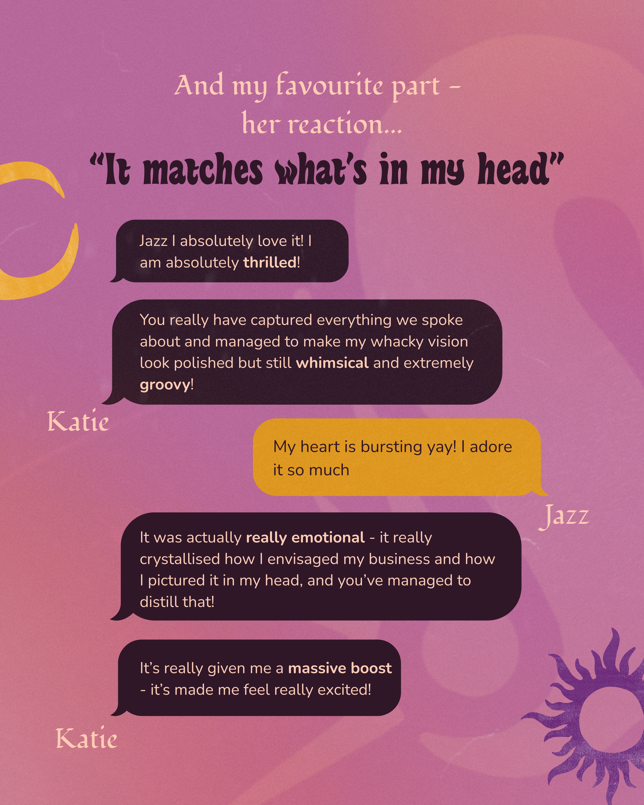
A social media post with a pink and purple abstract background with a sun graphic in pink and purple hues. The post contains a quote in large, bold text: "It matches what's in my head". There are also smaller comments in black speech bubbles, including "Jazz I absolutely love it! I am absolutely thrilled!", "You really have captured everything we spoke about and managed to make my whacky vision look polished but still whimsical and extremely groovy!", and "It's really given me a massive boost - it’s made me feel really excited!". The name "Katie" appears in pink at the bottom left of the image.
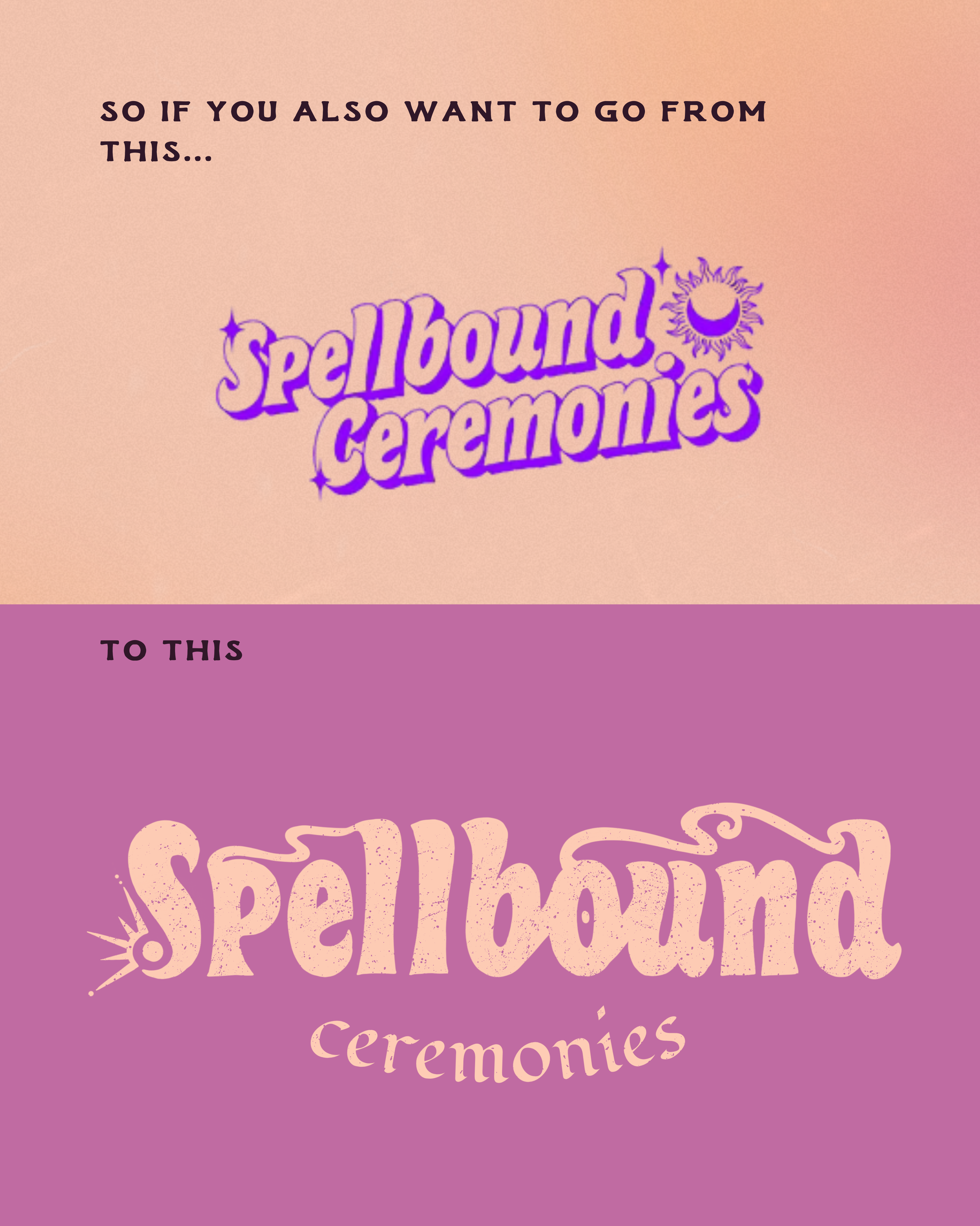
An infographic showing the transition from a pink background with the text 'so if you also want to go from this...' to another pink background with the text 'ceremonies' in a larger, decorative font, indicating a transformation.
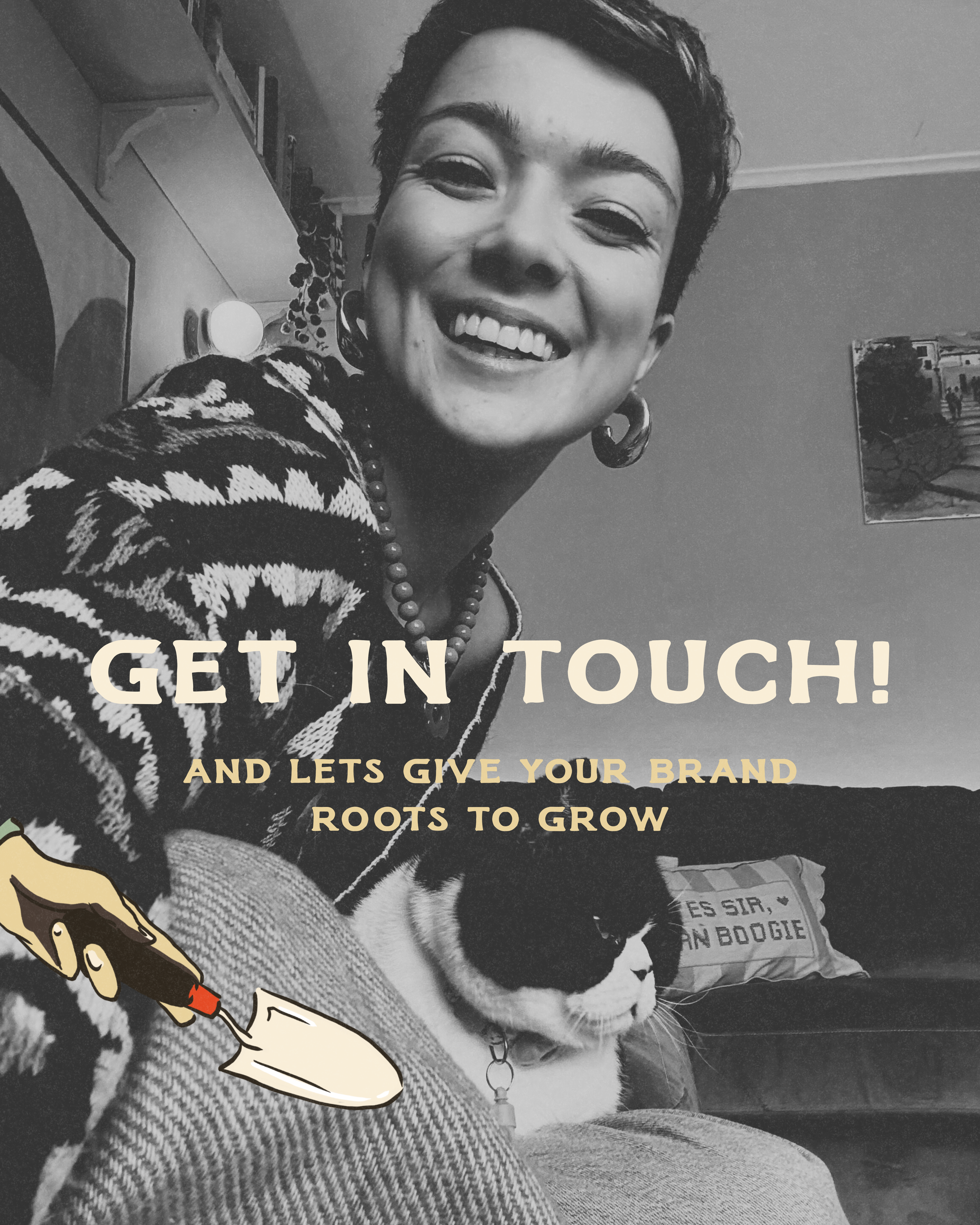
Black and white photo of a young woman with short hair, smiling brightly, wearing large hoop earrings, a patterned sweater, and a beaded necklace. There is a cat sitting on her lap, and the background includes a wall with a painting and some household items. Overlaid text reads 'GET IN TOUCH! AND LET'S GIVE YOUR BRAND ROOTS TO GROW'.