
Creative chaos (salon)
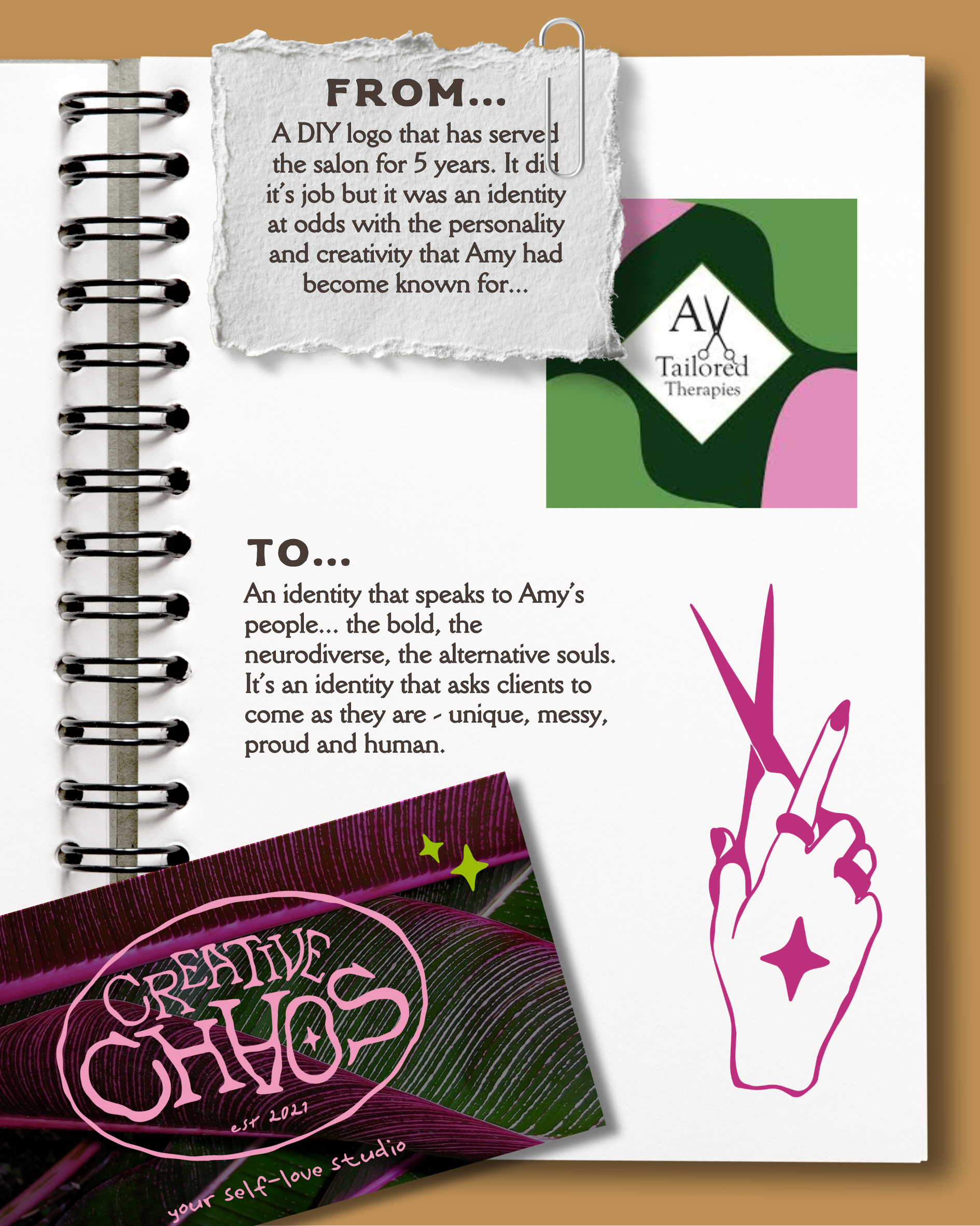
For five years, Amy's DIY brand did the job. But Creative Chaos had grown into something bigger - a judgement-free space for the bold, the alternative, the ones who want to be seen. Her identity needed to catch up.
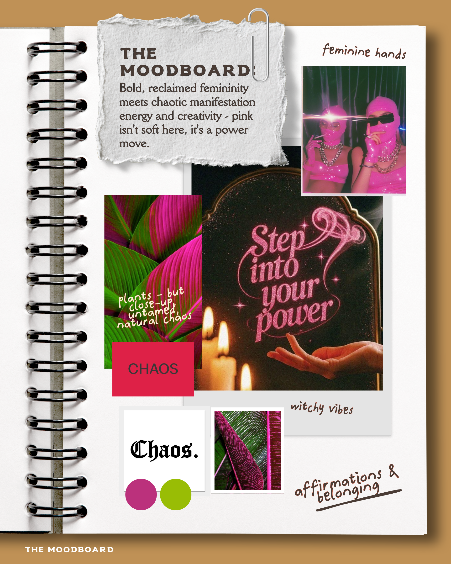
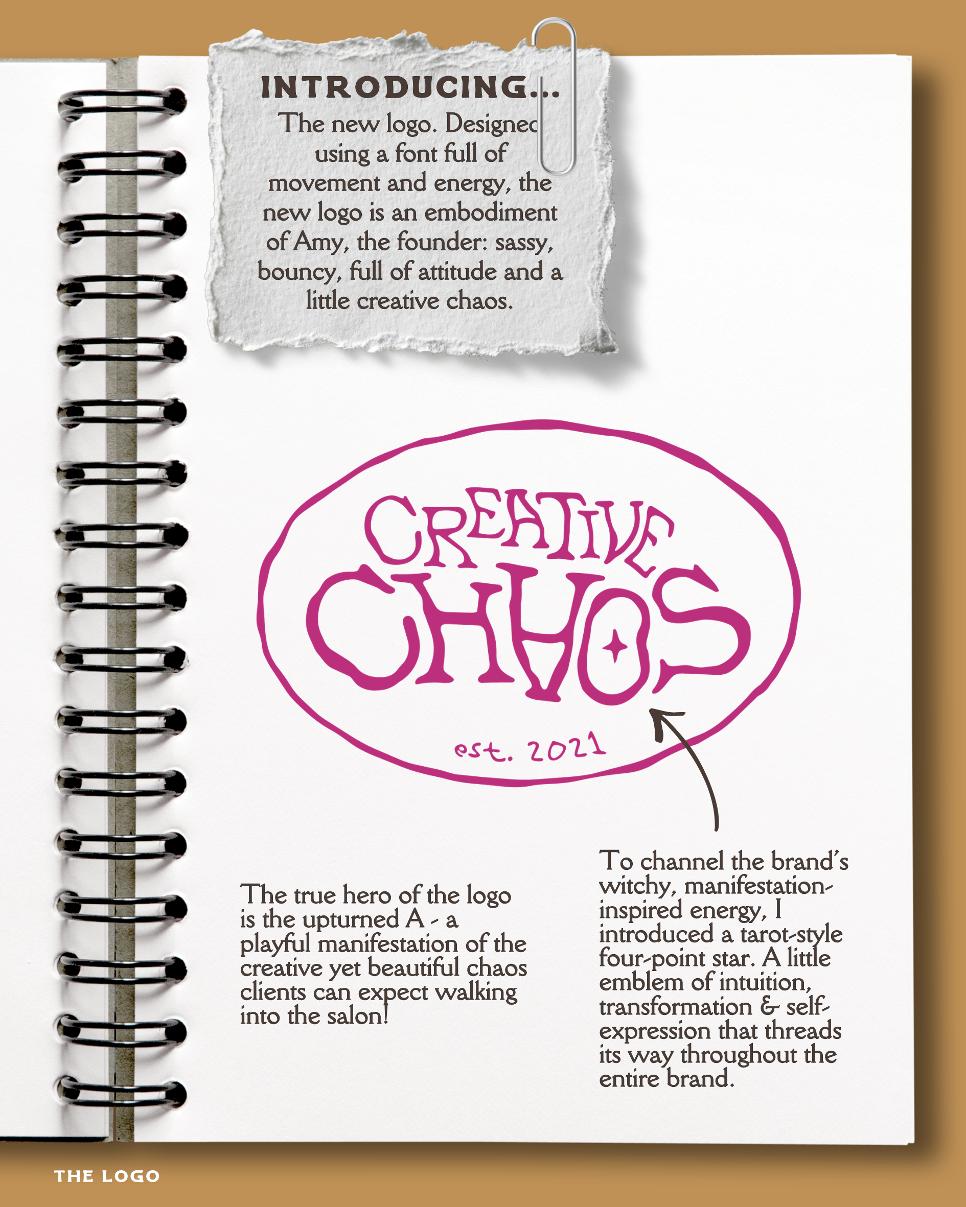
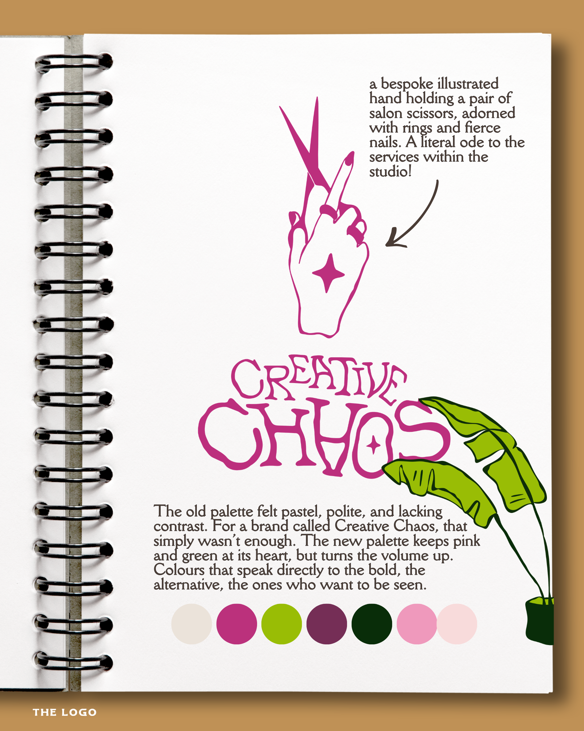
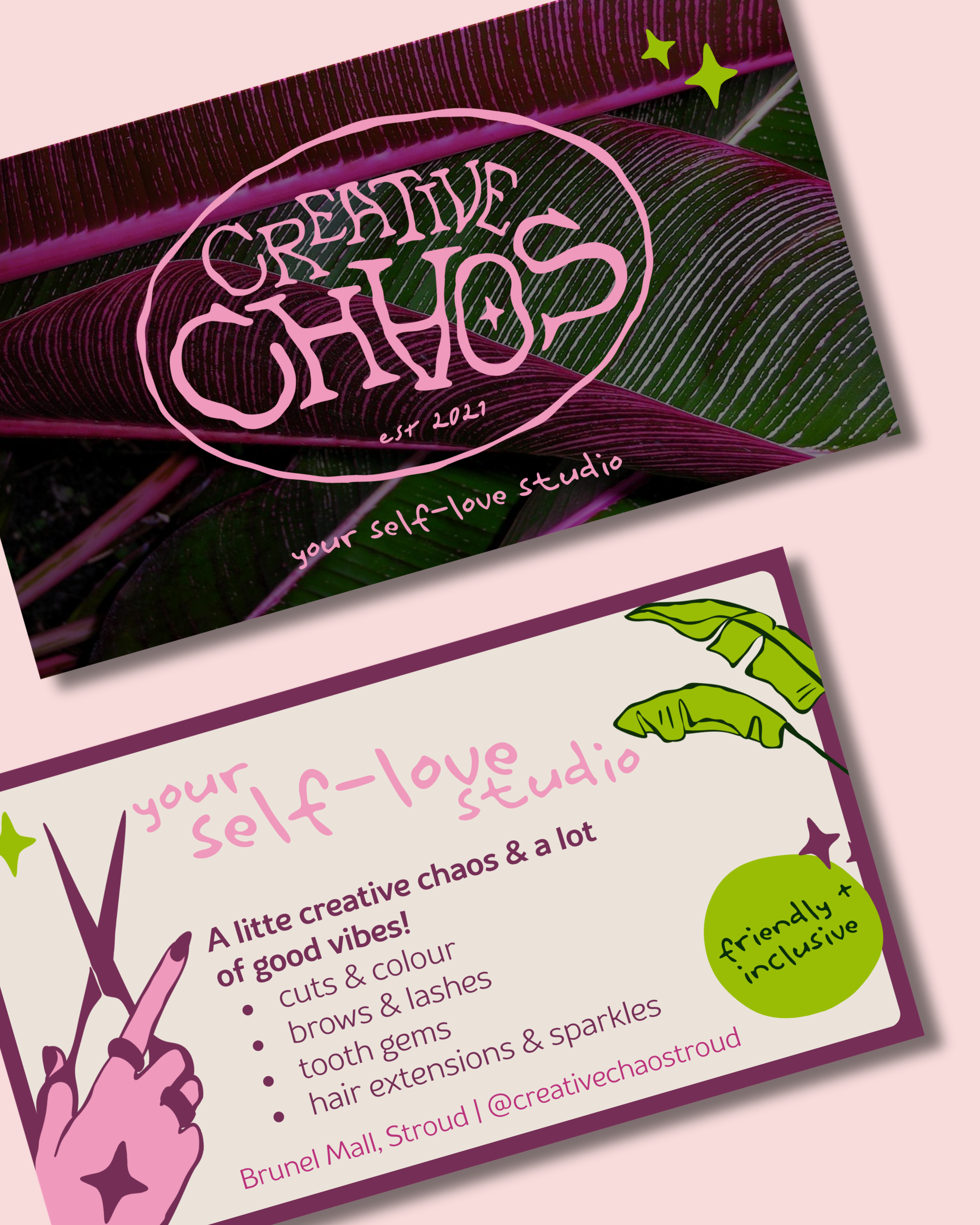
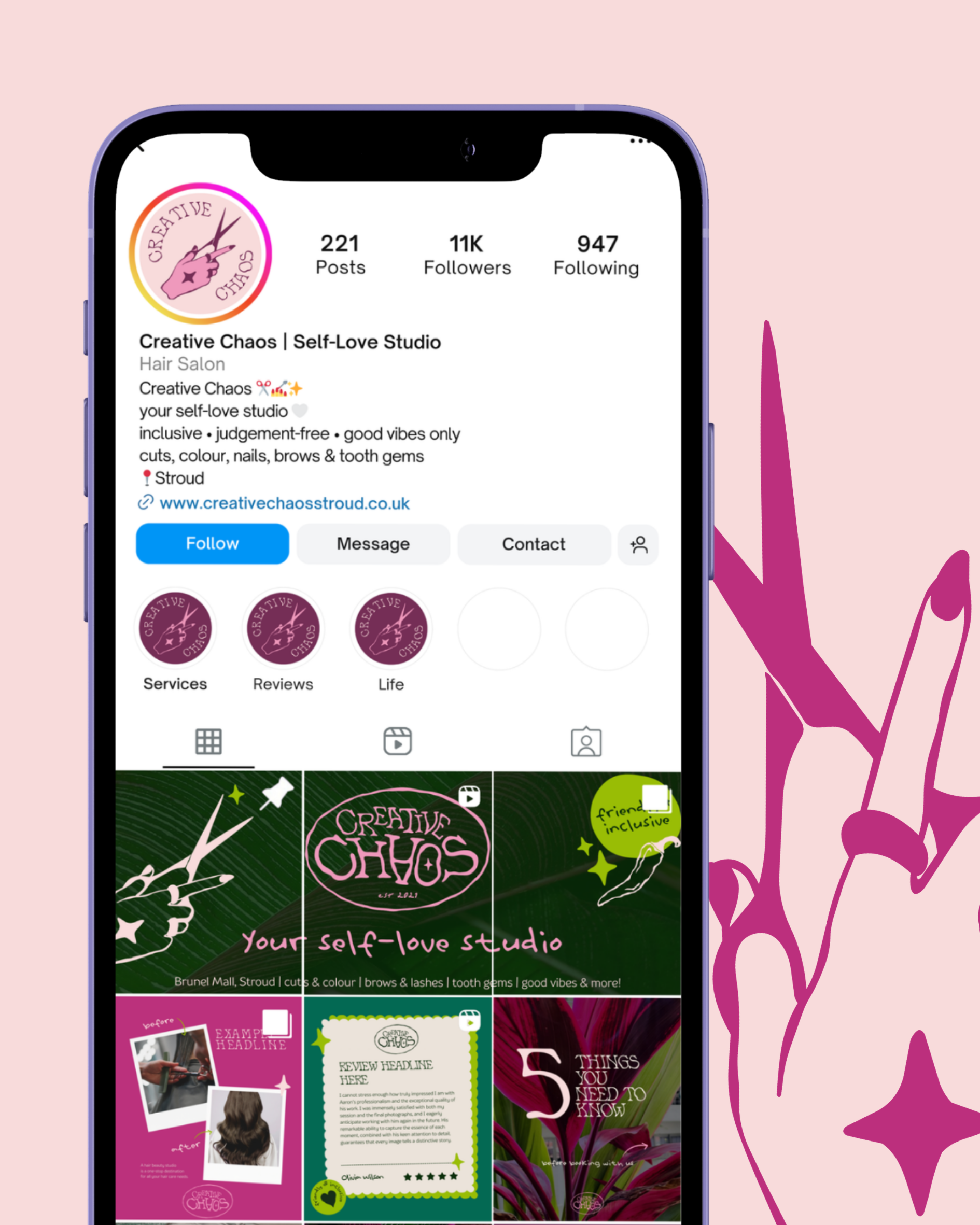
So we turned the volume up. Pink as a power move, witchy energy baked into every detail, and a logo as sassy and bouncy as Amy herself.
Package: The Prune.
Amy came to me to create a rebrand that felt: sassy, badass and like twinkly magic. With a bit of a witchy vibe thrown in!
Scroll to see from brief to brand…