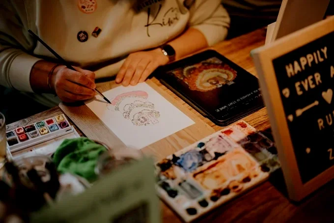
Illustration By Kiwi
A talented artist themself, Frankie (she/they) was so deep into their own award-winning illustration business that they couldn’t see how to update their brand identity... they desperately needed a design prune to elevate their look to their newfound credibility in the industry.
Package: The Prune.
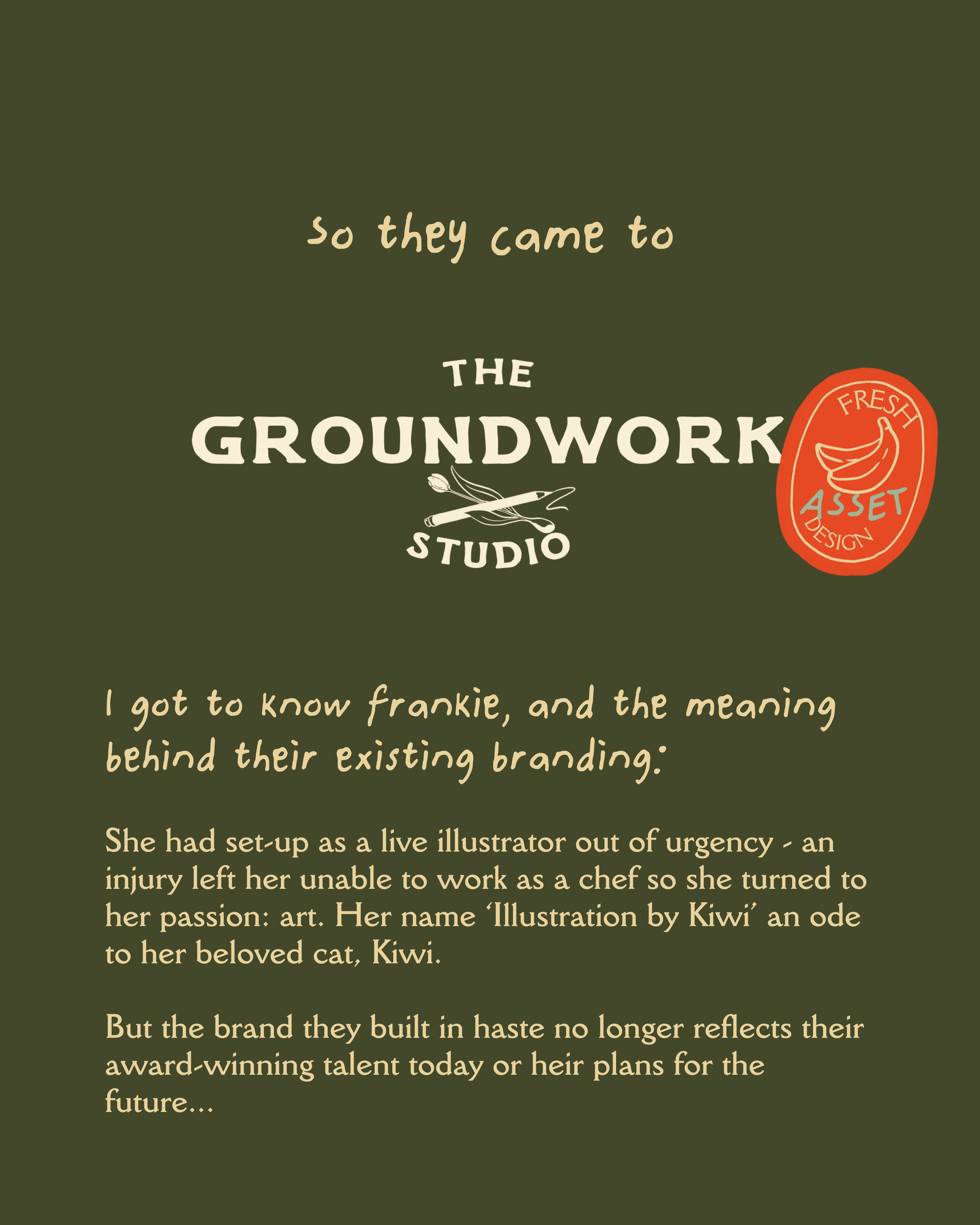
Frankie had set-up as a live illustrator out of urgency - an injury left her unable to work as a chef so she turned to her passion: art. Her name ‘Illustration by Kiwi’ an ode to her beloved cat, Kiwi.
But the brand they built in haste no longer reflects their award-winning talent today or their plans for the future...
Scroll to see from brief to brand…
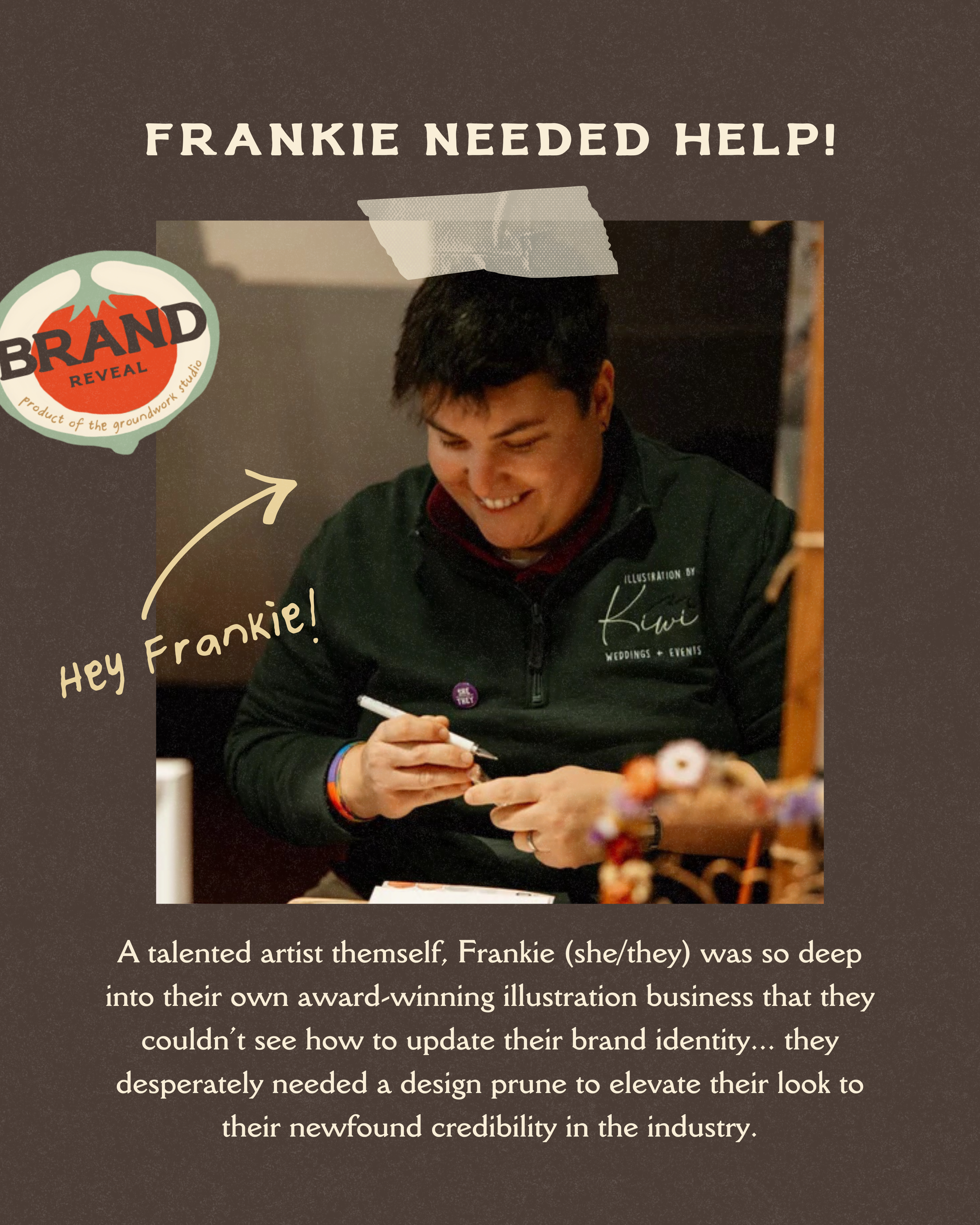
A person smiling while writing or drawing with a marker at a table, with a blurred background. The image is overlaid with graphic elements and text related to branding and illustration.
Close-up of a book or printed material with green background and beige text discussing branding, illustration, and a chef named Kiwi, with a red circular badge featuring a banana and the words 'Fresh Asset Design'.
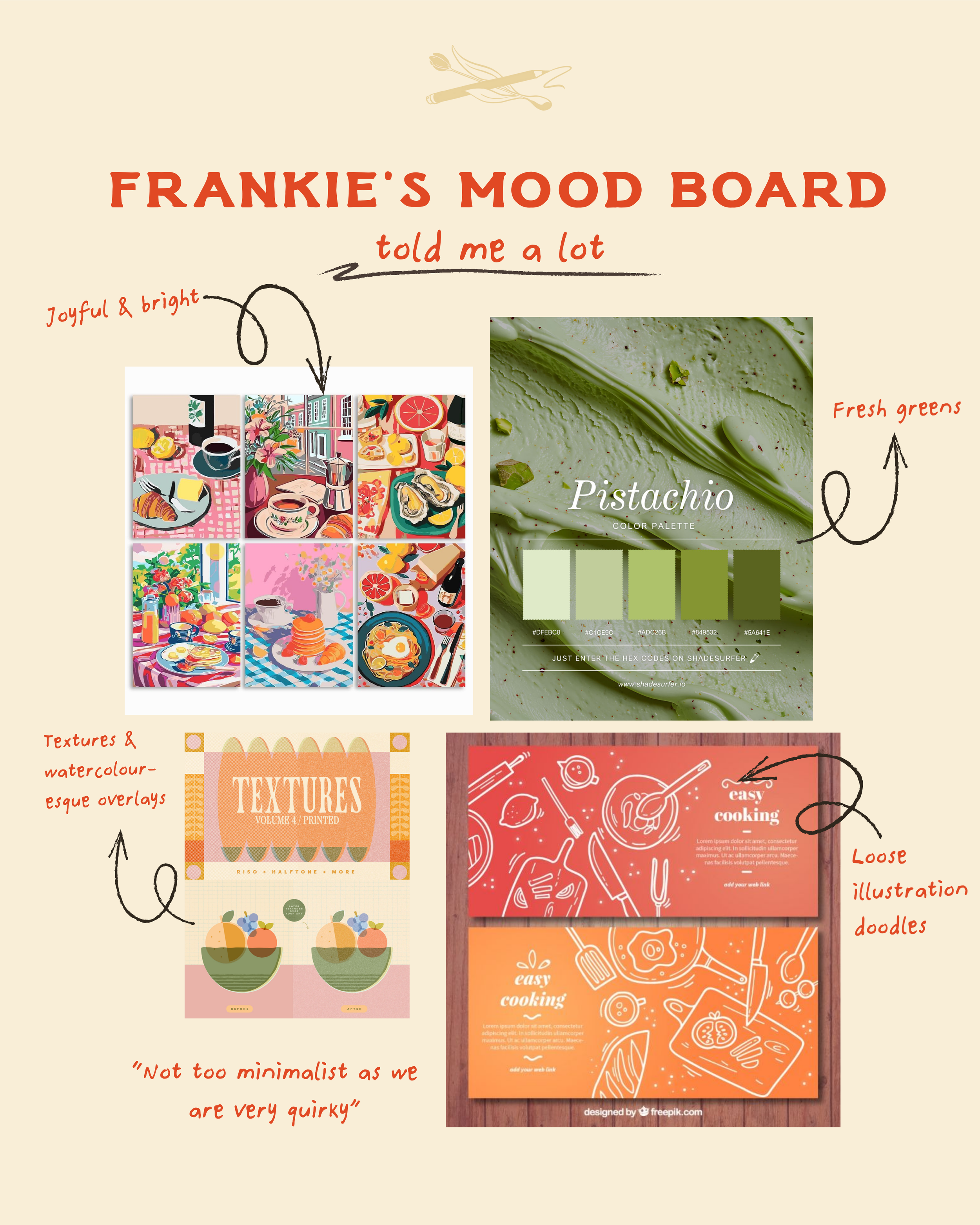
A colorful digital collage featuring various illustrated recipes, textures, watercolor overlays, and doodles. An example includes a pistachio color palette swatch, a food illustration section labeled 'Not too minimalist as we are very quirky', and a quote about not being very minimalistic.
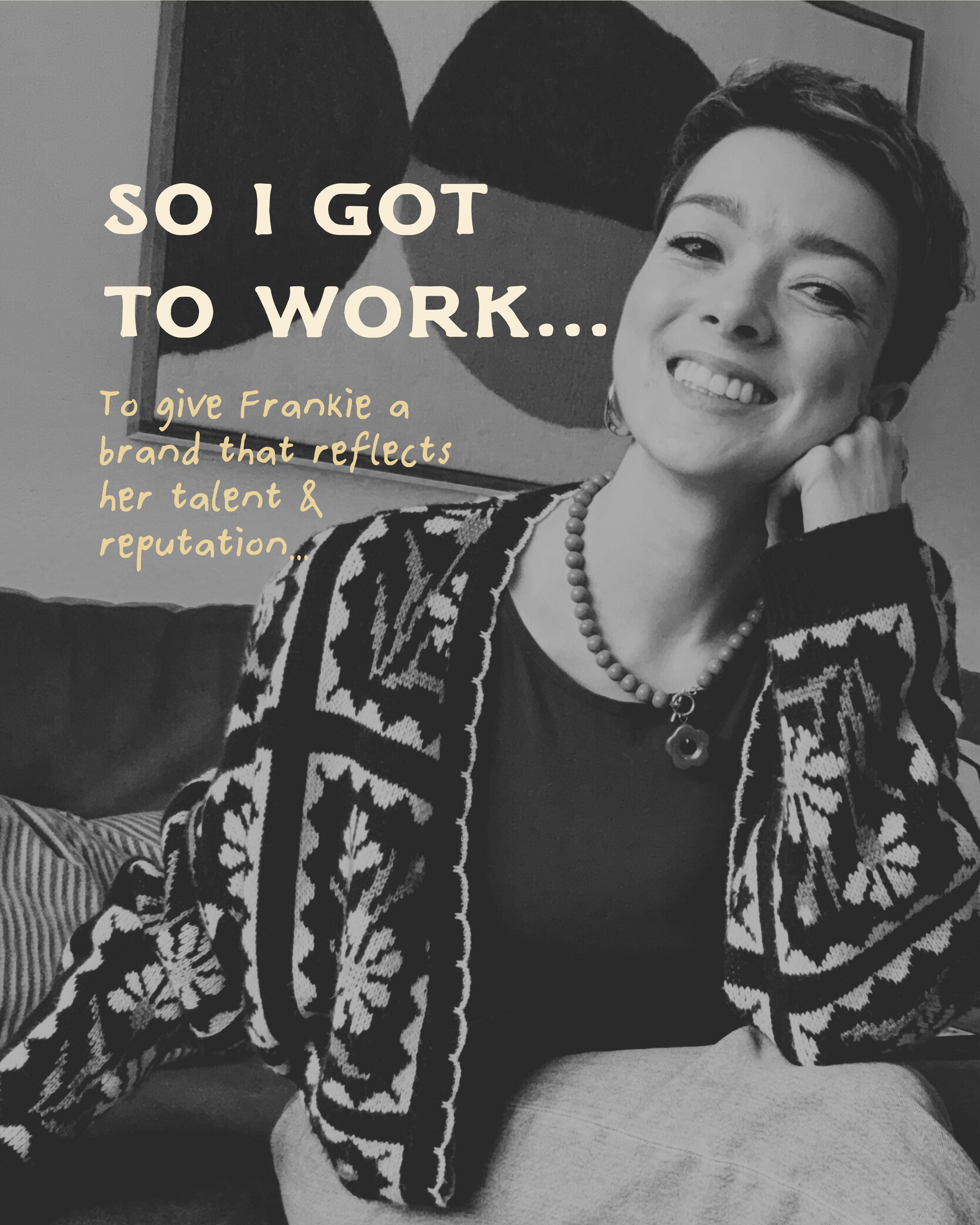
Black and white photo of a smiling woman with short hair wearing a patterned sweater, jewelry, and resting her hand on her neck. She is sitting on a couch with a framed painting or photo on the wall behind her.
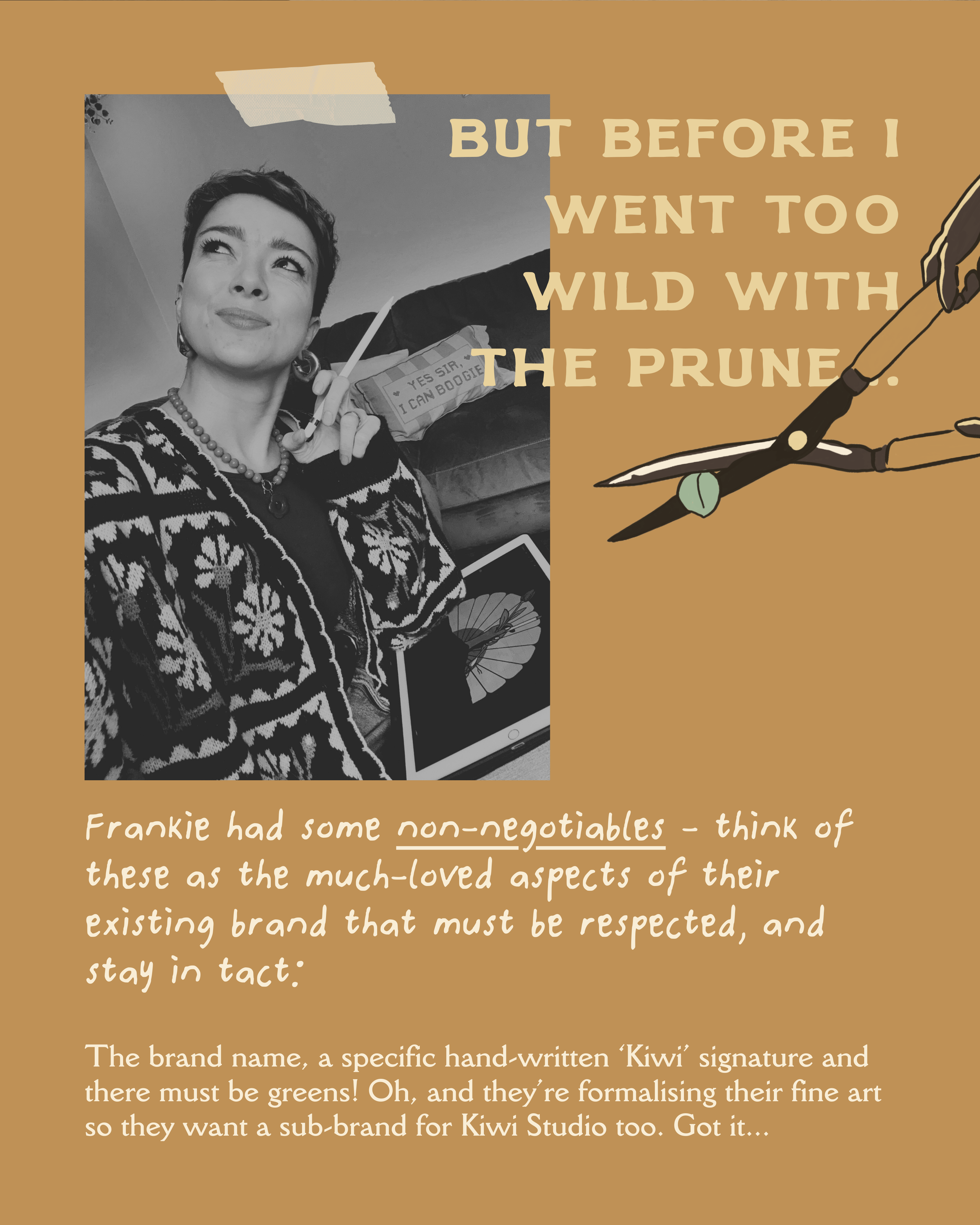
A woman with short dark hair, wearing earrings, a necklace, and a patterned sweater, is holding a stylus pen and a tablet with a drawing of a traditional Japanese umbrella. The image is in black and white. There is a hand holding a pruning shear with a small green leaf attached to the blade, which is part of an illustrated graphic on the right side of the image. The background of the graphic is beige with a brown border, and there is a text overlay in beige capital letters that reads, 'BUT BEFORE I WENT TOO WILD WITH THE PRUNE.'
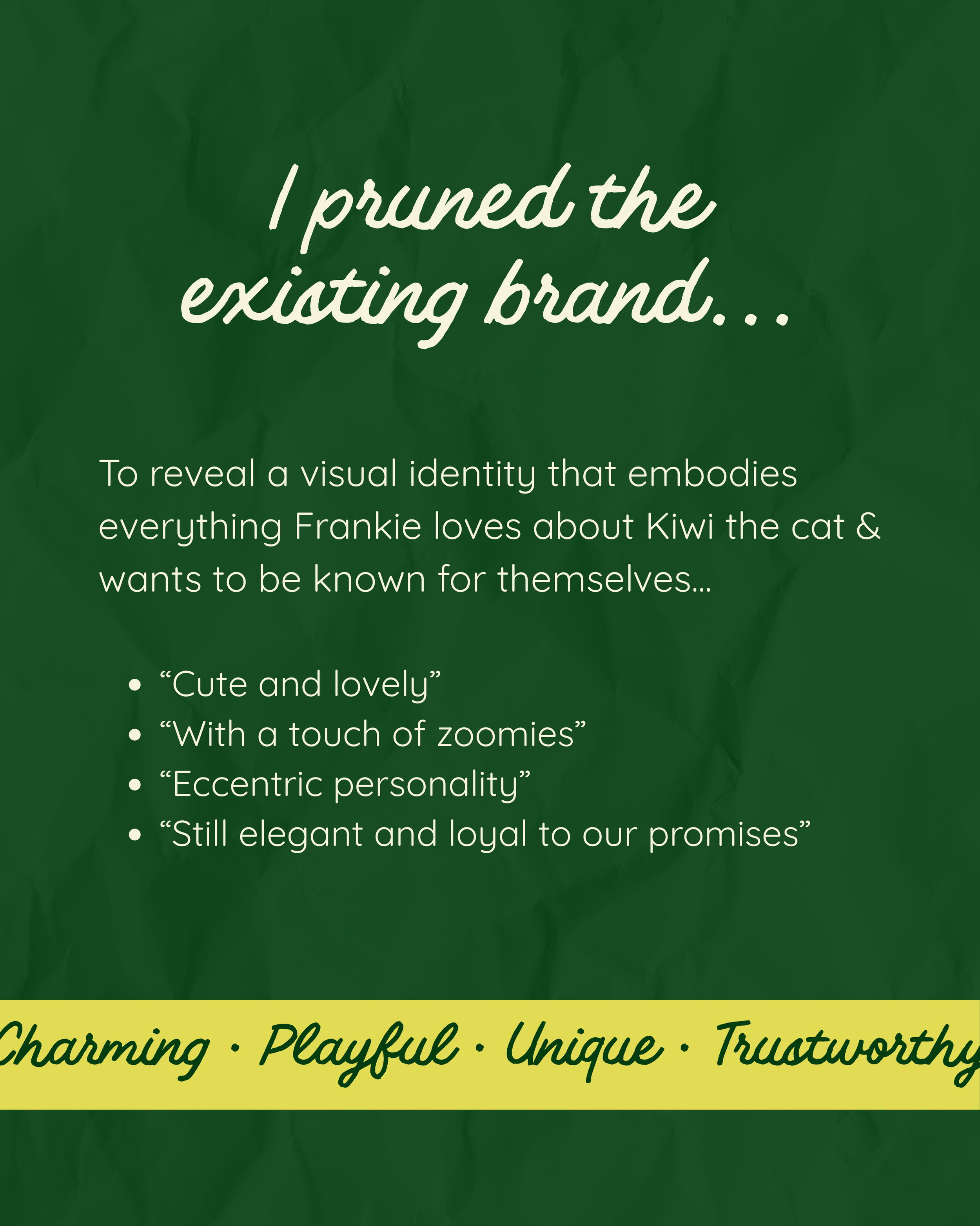
A green background with white and yellow text about a visual identity for a brand related to a cat named Kiwi, describing characteristics such as being cute, lovely, with a touch of zoomies, eccentric personality, still elegant, loyal, and trustworthy.
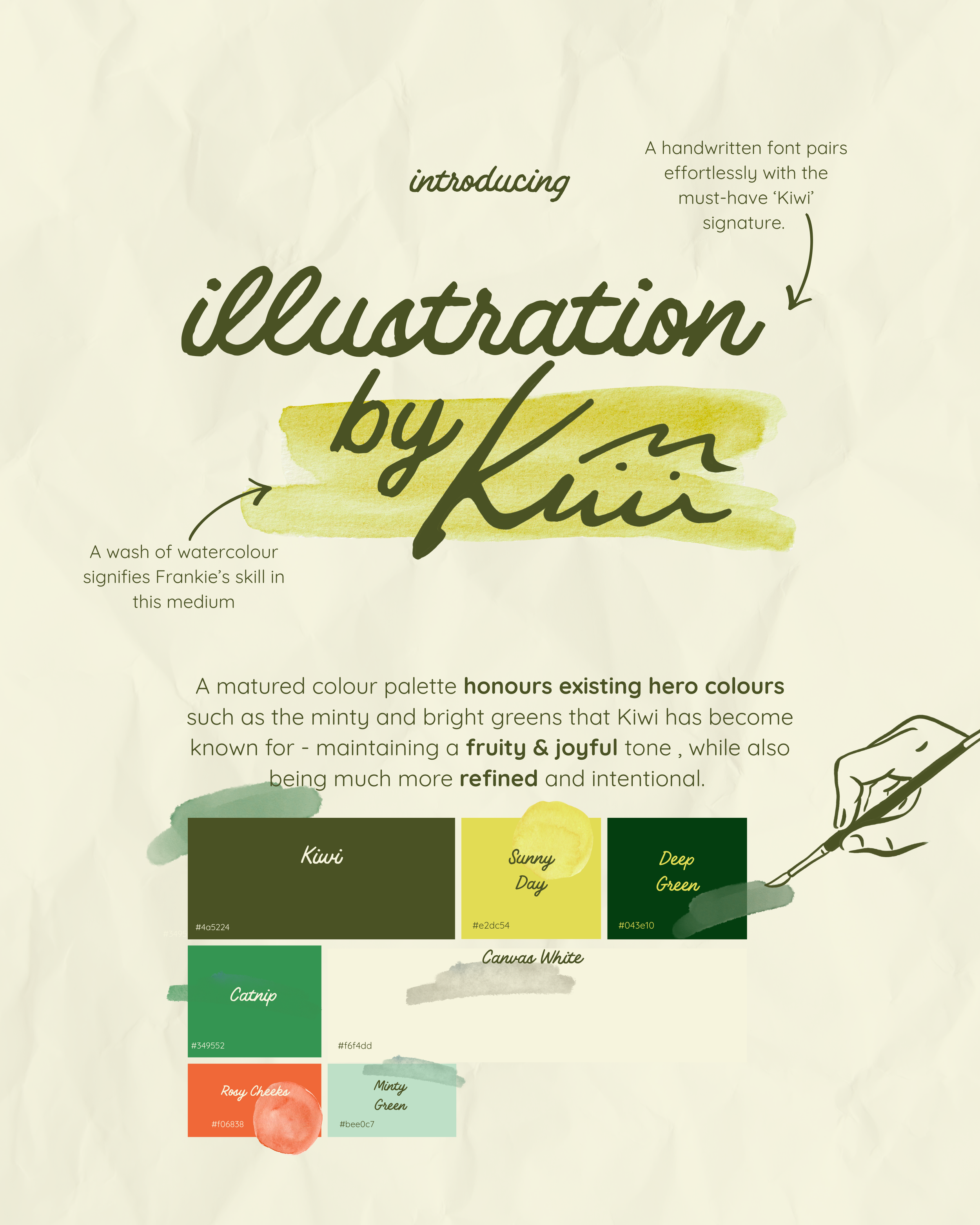
A guide to watercolor painting of a color palette inspired by Kiwi, featuring swatches labeled Kiwi, Sunny Day, Deep Green, Canipa White, Catnip, Rosy Cheeks, and Minty Green, with corresponding hex codes and watercolor washes.
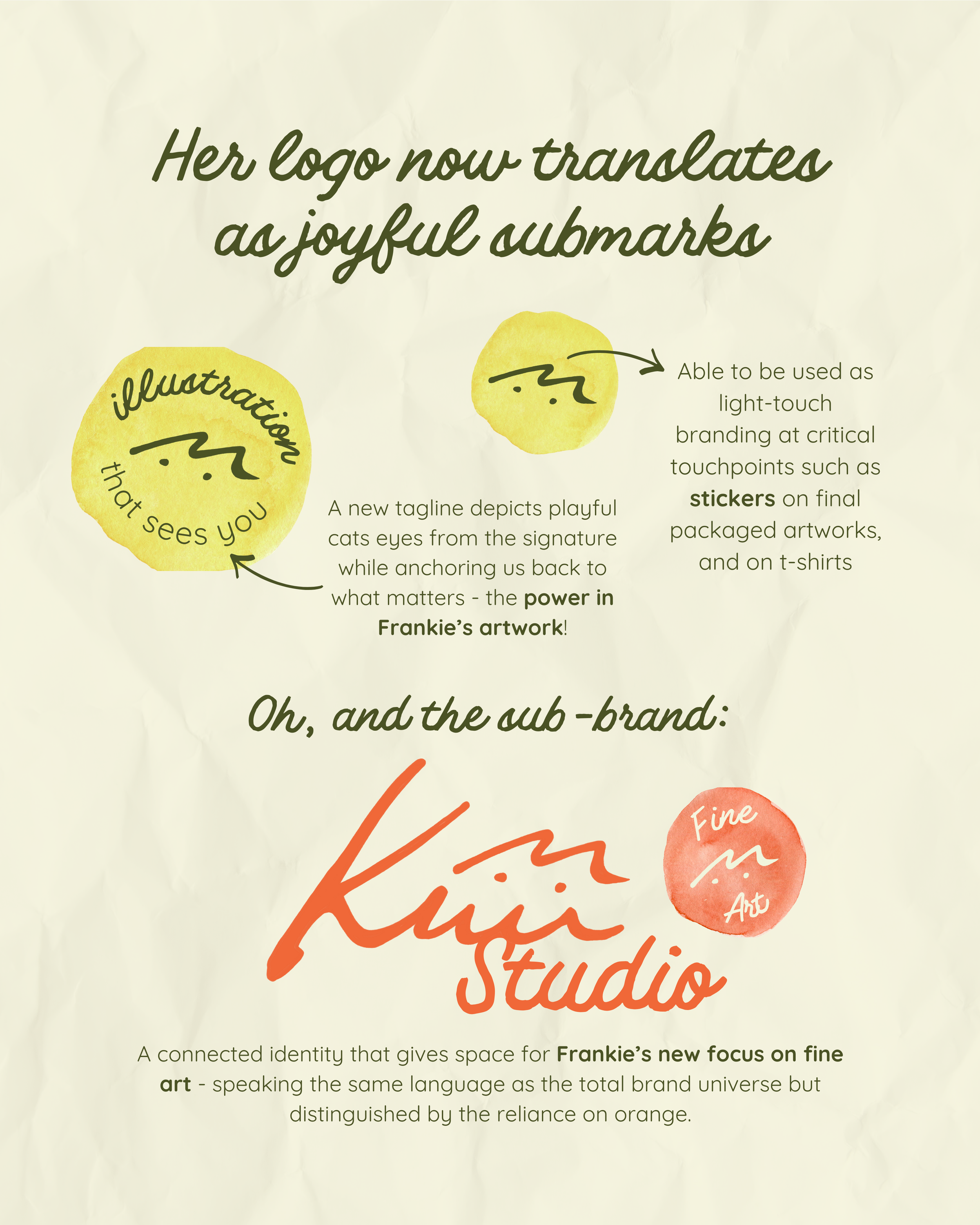
A graphic design with the central message: "Her logo now translates as joyful submark" in cursive font. It features two yellow watercolor circle illustrations, one with the word "illustration" and the other with a doodle of a face and the text "Able to be used as light-touch branding at critical touchpoints such as stickers on final packaged artworks, and on t-shirts." There is also a red watercolor circle with the words "Fine Art" inside. The background appears crumpled paper, and there is additional text at the bottom about a brand called Frankie’s.
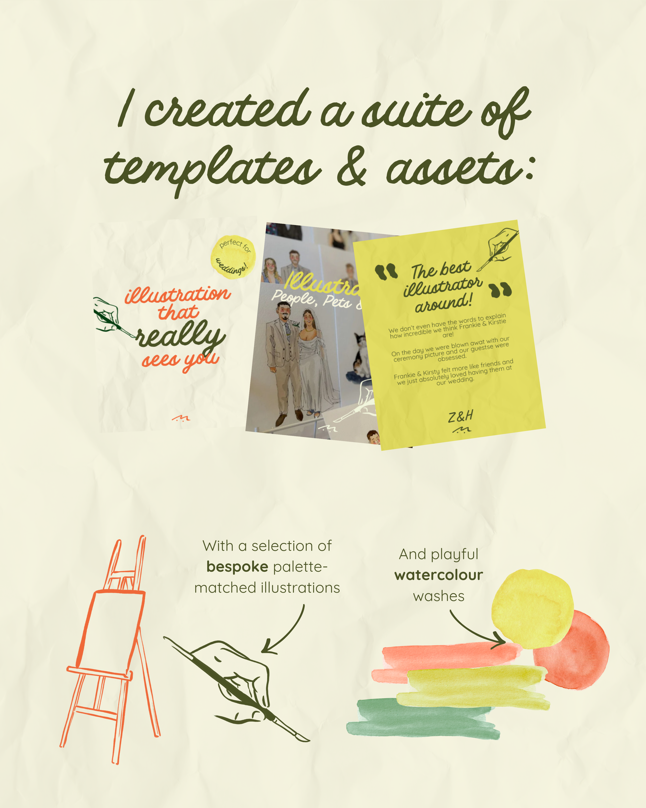
A collage of various paper templates and assets, including a yellow note with a quote, illustrated figures, and watercolor swatches, with title text indicating the creation of templates and assets.
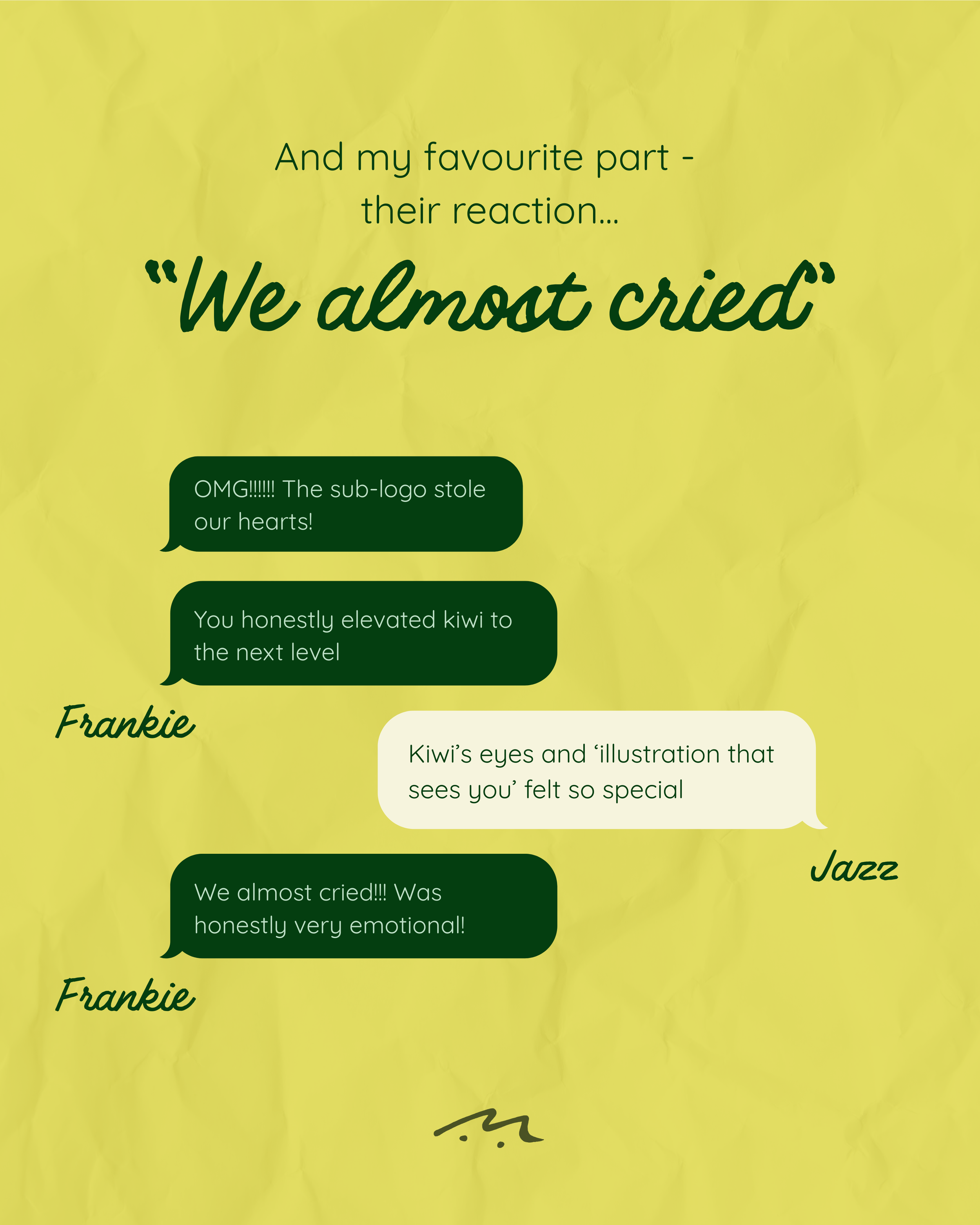
A colorful graphic with a yellow background and various speech bubbles containing text. The main text reads 'And my favourite part - their reaction...
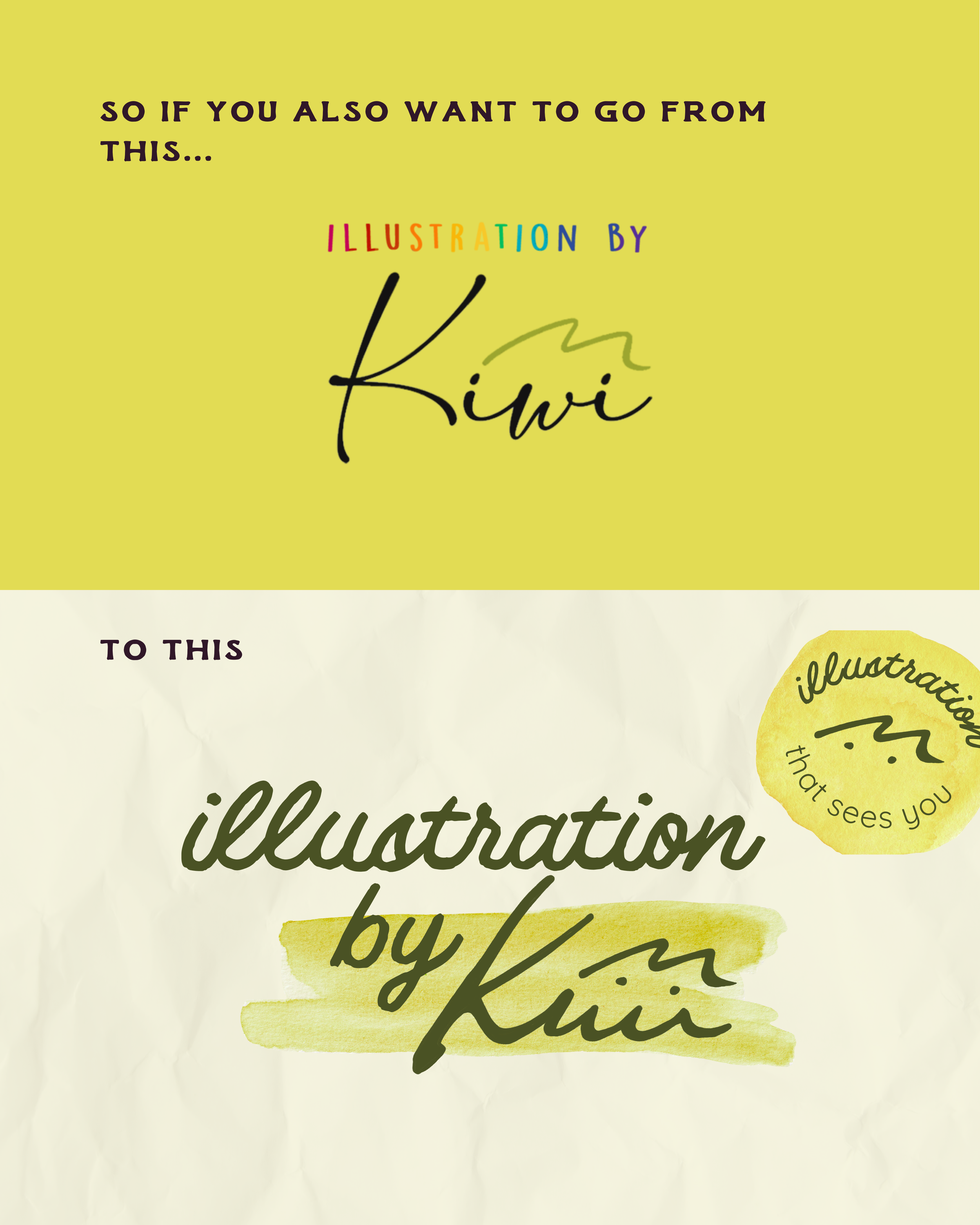
The image displays colorful text on a yellow and cream background, with the primary message reading, 'So if you also want to go from this...'. The focus is on the word 'Kuwi' in a handwritten style with a signature-like appearance.
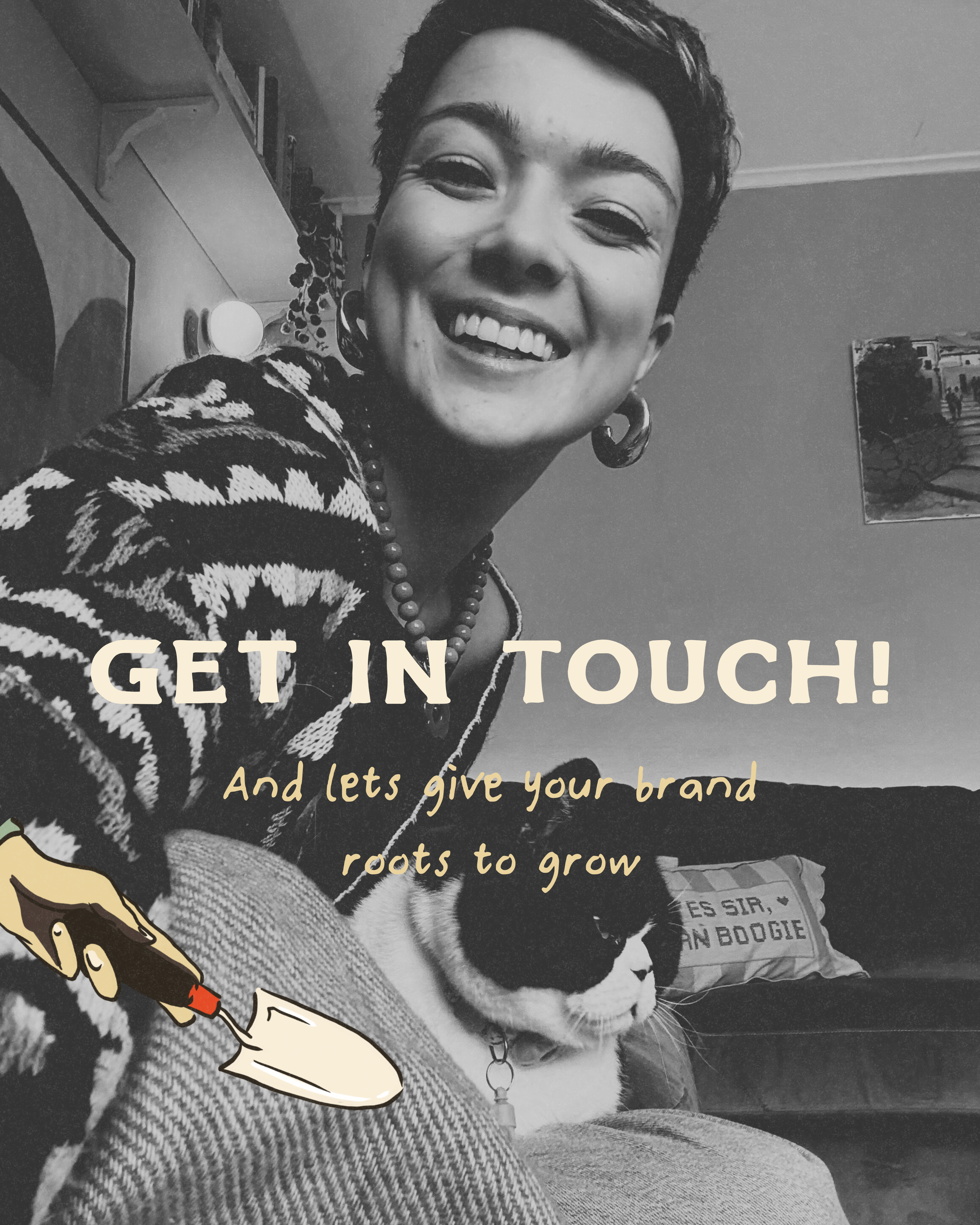
Close-up of a smiling woman with short hair, wearing earrings, a patterned sweater, and a beaded necklace, sitting on a couch with a cat and posters in the background. Overlaid text reads 'GET IN TOUCH! And let’s give your brand roots to grow'.