

Yes - you read that right. Of course I had to brand myself too.
After years of (sometimes accidentally) honing my craft alongside fledgling founders, I knew exactly who The Groundwork Studio needed to speak to. The dreamers in the early days. The ones with big ideas, boundless passion, and not always the deepest pockets. A studio built to meet people where they’re at - sleeves rolled up, hands in the soil, unafraid to get a little messy.

The Groundwork Studio
Package: Breaking Ground.
The brief was simple and sincere: a brand that feels humble, honest, and rooted in the belief that sometimes, just planting the seed is enough.
Scroll to see from brief to brand…

Orange background with white text and a white illustration of a pen, a leaf, and a flower. Text reads 'The Groundwork Studio'.
A tan-colored background with a drawing of a pen and a small flower or plant above it. Text reads: "Take Root & Grow with Good, Honest Brand Design."
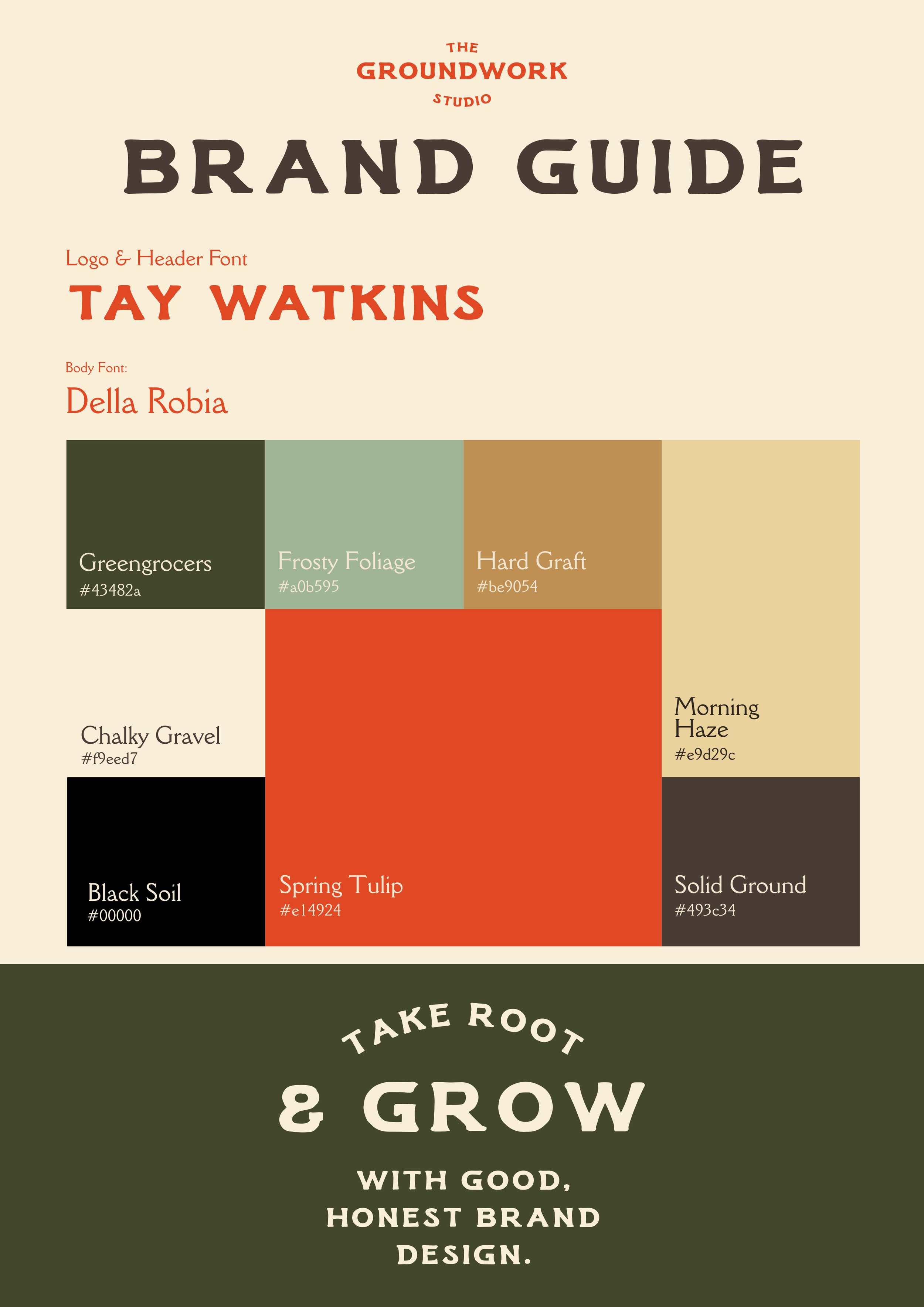
From there, the brand universe unfolded naturally. Gardening metaphors are gently woven through the foundations, with service packages named after essential stages of growth: Breaking Ground, The Prune, and Tending. The colour palette leans less “earthy brown” and more “vibrant local greengrocer” - fresh, alive, and full of possibility.
Business Card
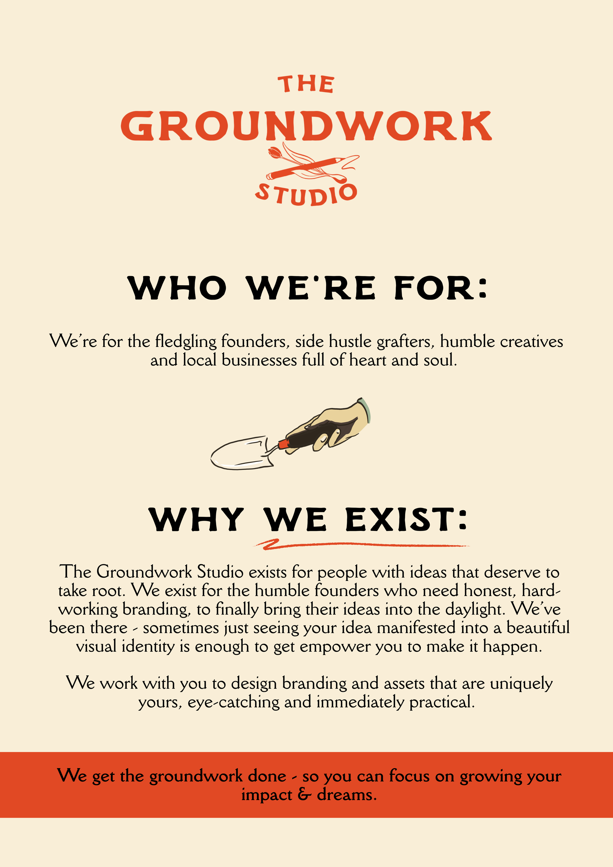
A webpage for The Groundwork Studio with sections titled 'Who We're For' and 'Why We Exist'. The page features a logo at the top with a paintbrush, a pencil, and a feather. An illustration of a hand holding a trowel is visible. The background is cream-colored with red and black accents.

Four different colored designs of a square with the words 'Brand Guide' at the top, 'The Groundwork Studio' in the middle with a paintbrush and pencil icon, and 'In Practice' at the bottom with a handshake icon.
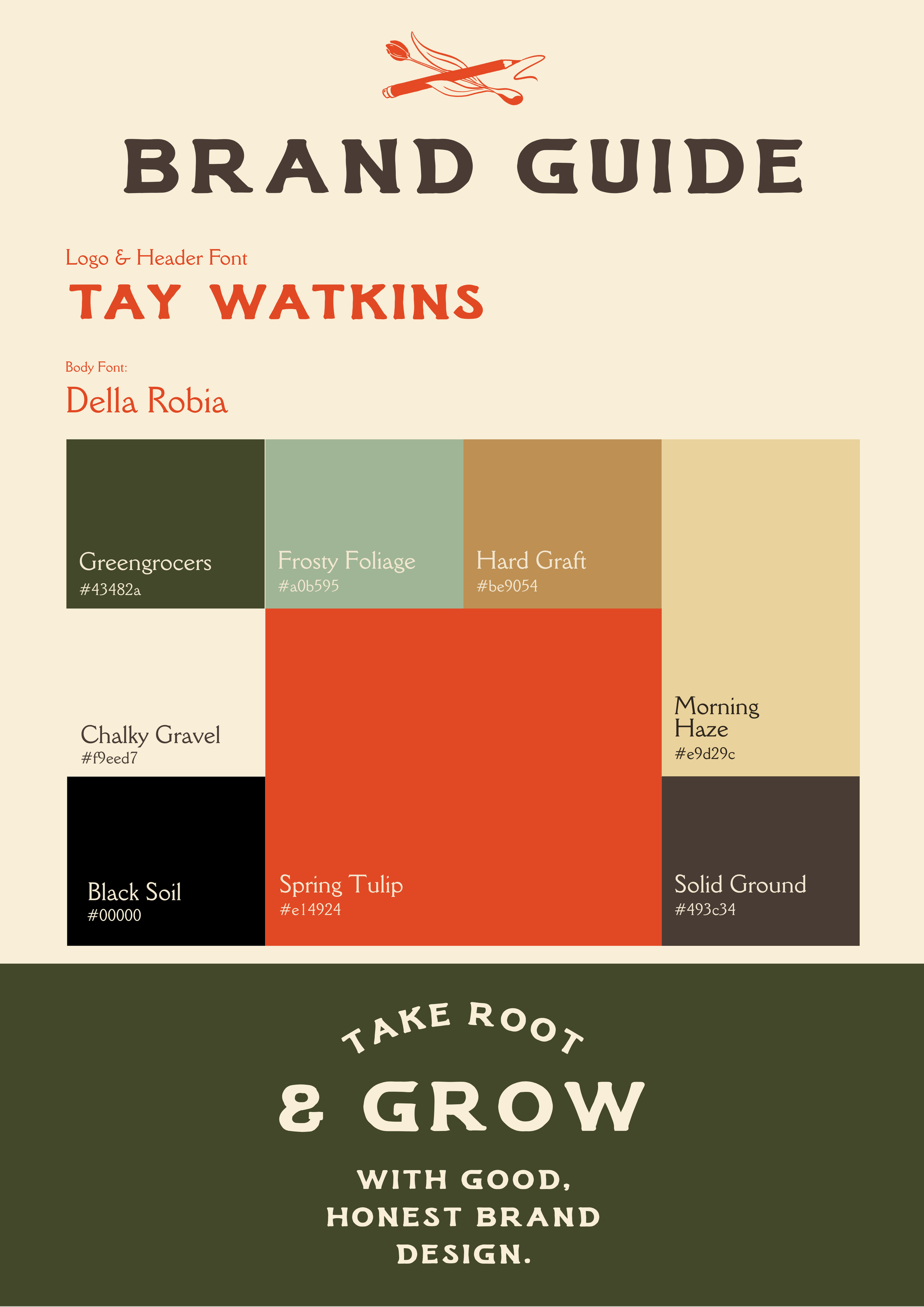
Brand guide page with color swatches and font details, featuring a logo with a pencil and paintbrush, and the phrase 'Take Root & Grow with Good, Honest Brand Design'.
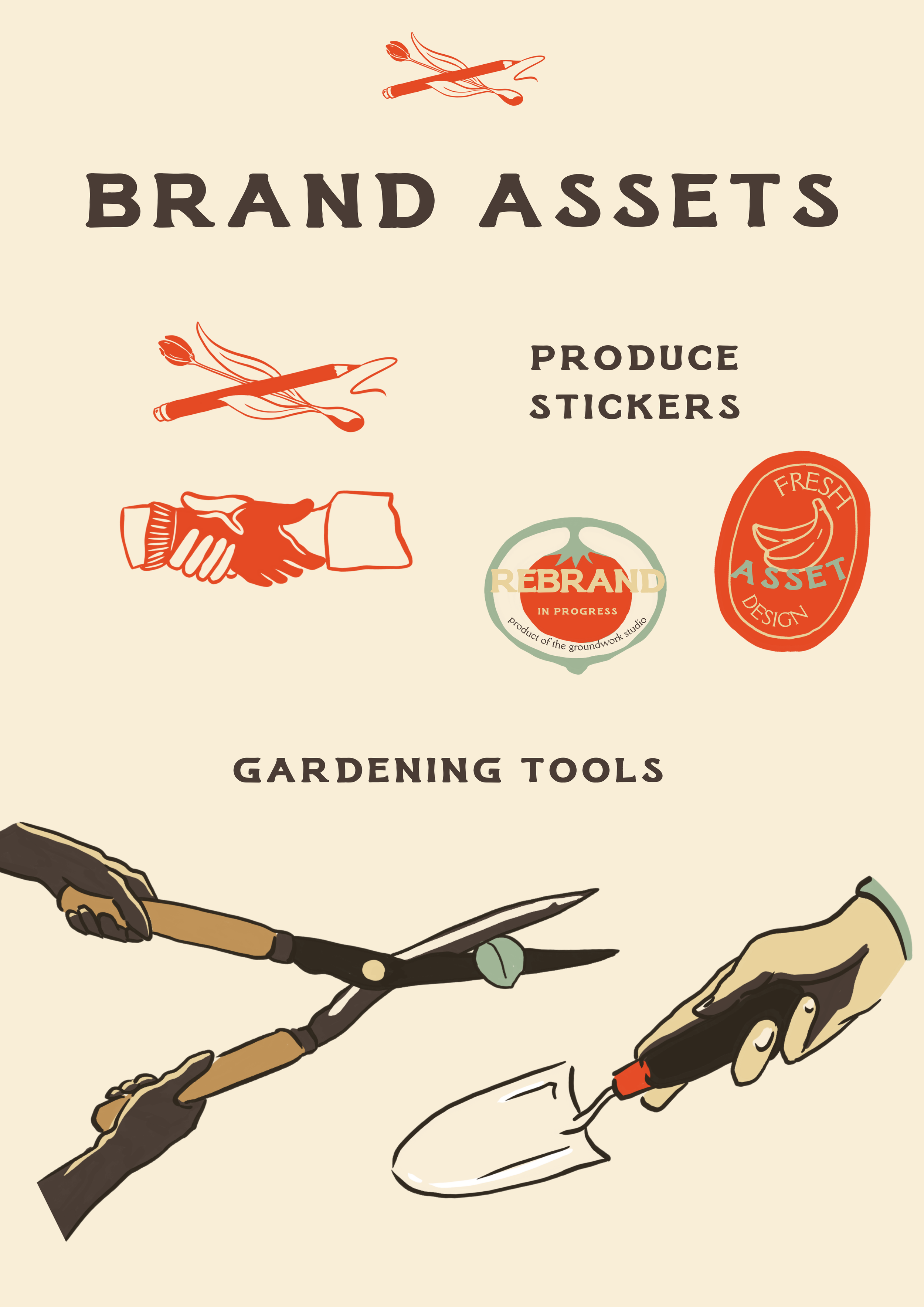
From there, the brand universe unfolded naturally. Gardening metaphors are gently woven through the foundations, with service packages named after essential stages of growth: Breaking Ground, The Prune, and Tending. The colour palette leans less “earthy brown” and more “vibrant local greengrocer” - fresh, alive, and full of possibility.
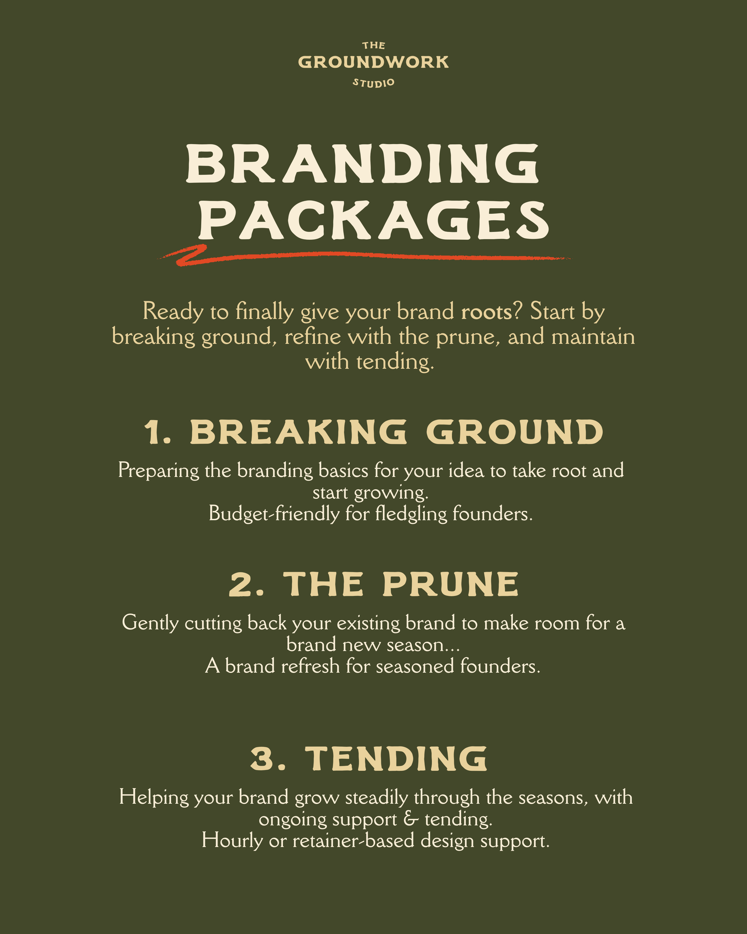
Packages that speak to the overarching metaphor of the brand. A studio for new beginnings. Built from the ground up.

Packages that speak to the overarching metaphor of the brand. A studio for new beginnings. Built from the ground up.

Packages that speak to the overarching metaphor of the brand. A studio for new beginnings. Built from the ground up.
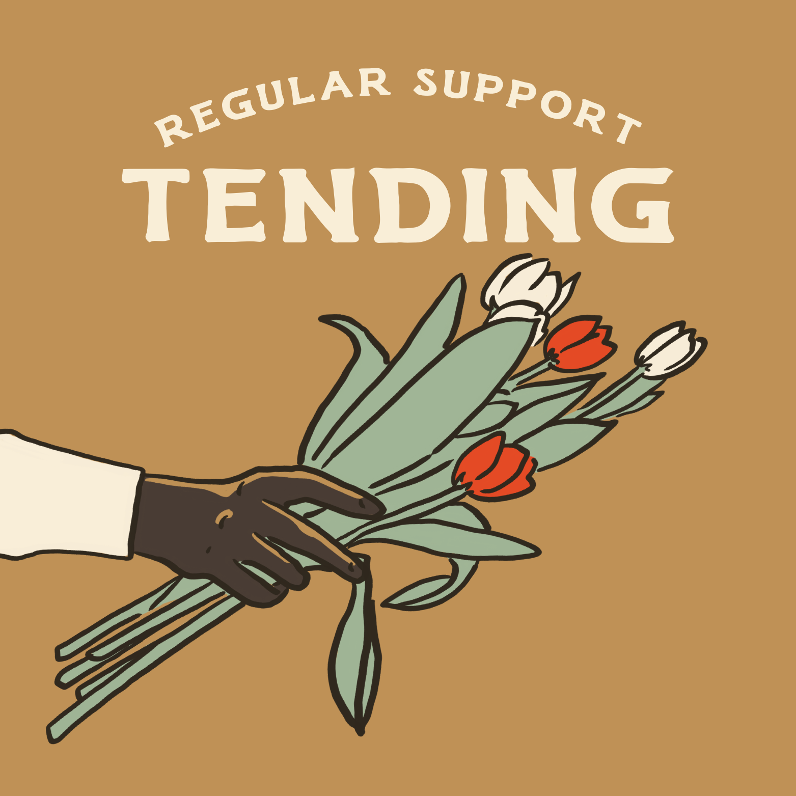
Packages that speak to the overarching metaphor of the brand. A studio for new beginnings. Built from the ground up.