

Wanderlust camping club
Matt and Nat had built something genuinely special - a directory of camping and glamping sites that most people scroll straight past. Hidden gems, off the beaten track, curated for the ones who actually want to find them. What they needed was a brand that felt the same way: cool enough to earn the trust of a younger crowd, credible enough to mean something to site owners too.
A brand built for the adventure seekers.
Package: The Prune.

scroll to see from brief to brand…


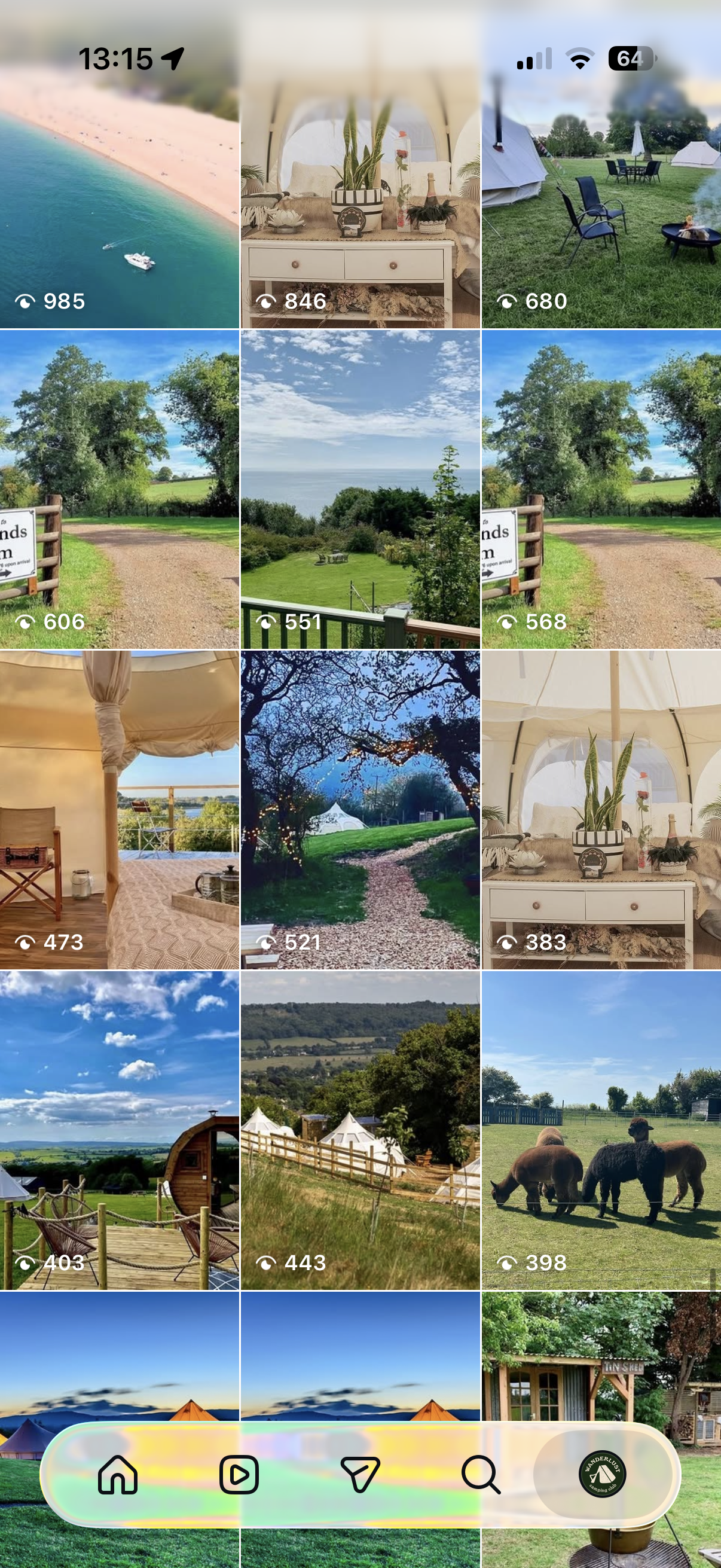
Before rebrand & social media templates
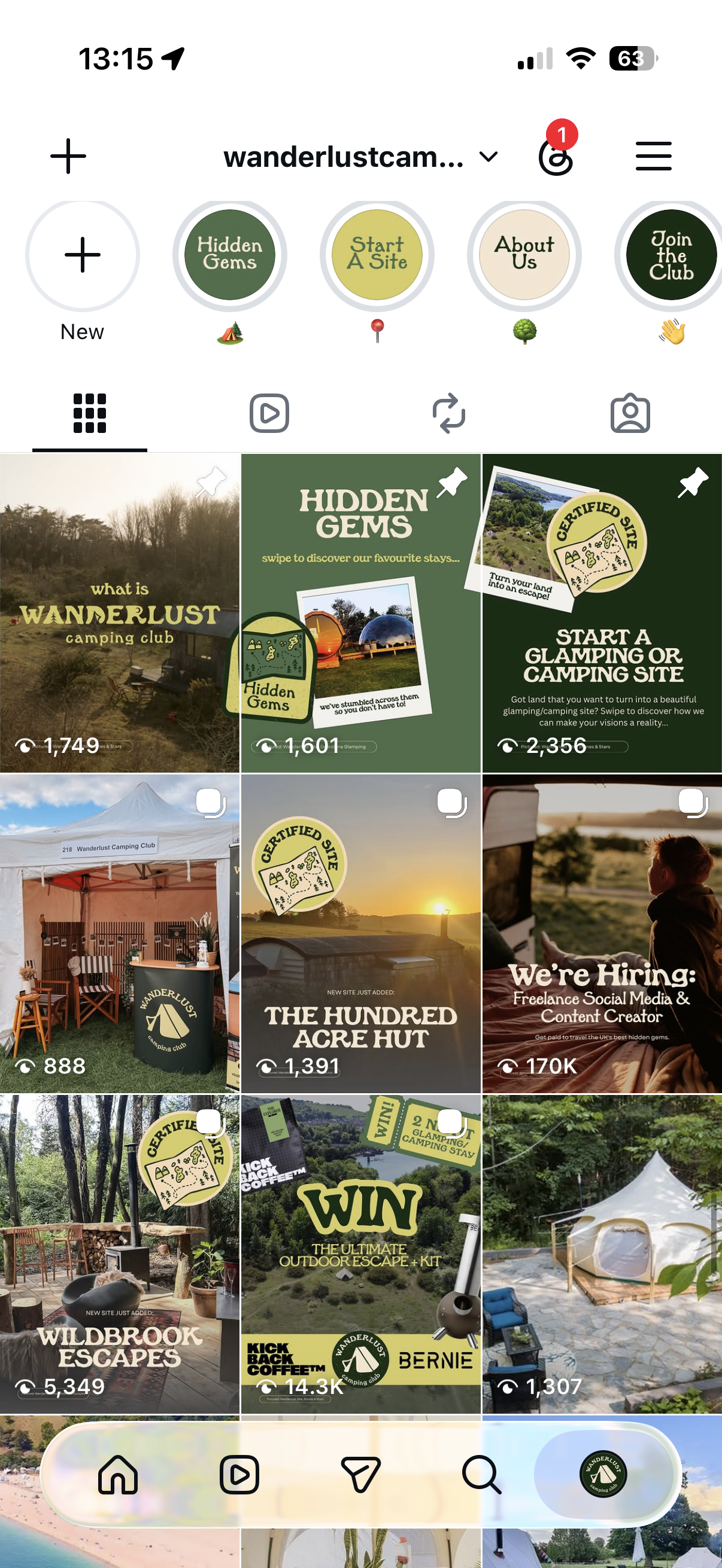
After rebrand & social media templates
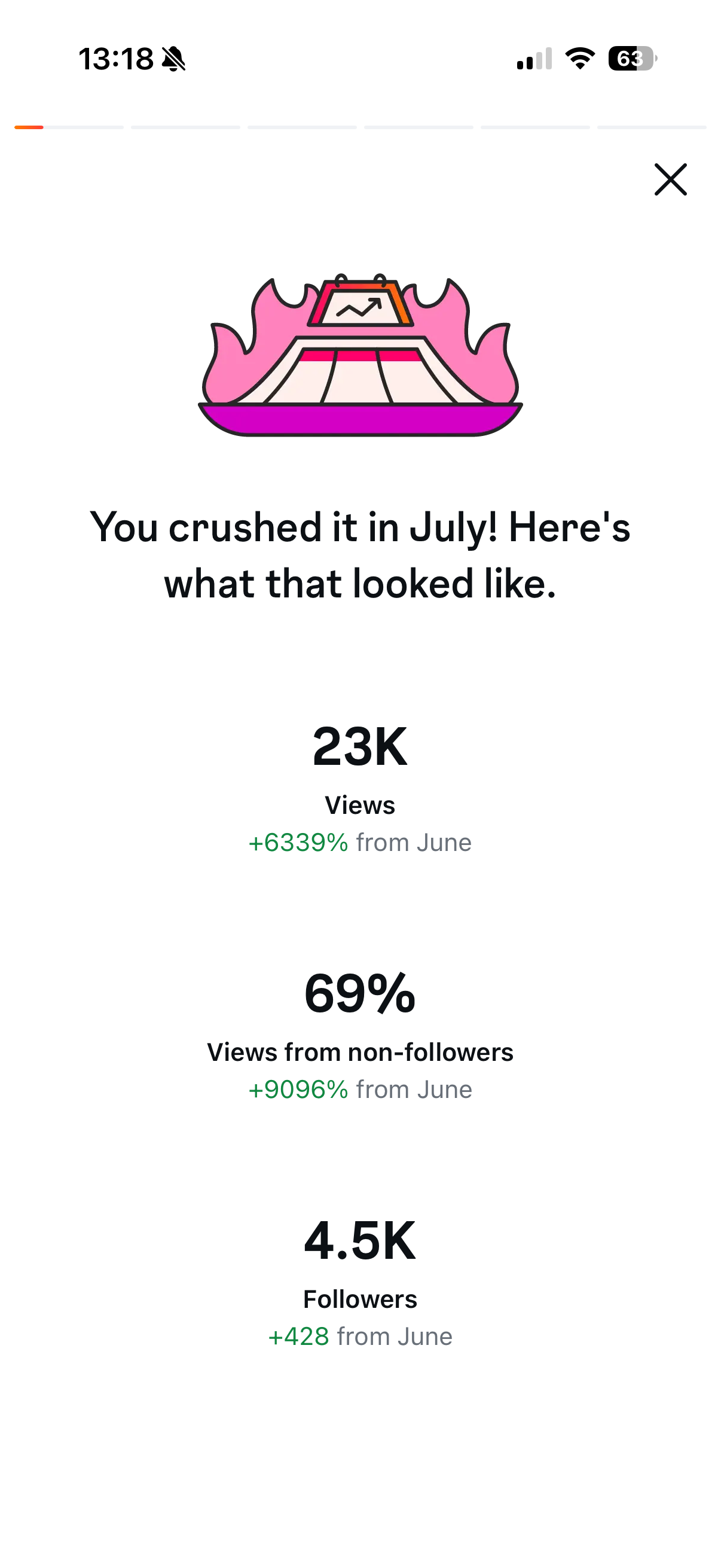
First month live with rebrand & templates saw +428 followers and 23k views!
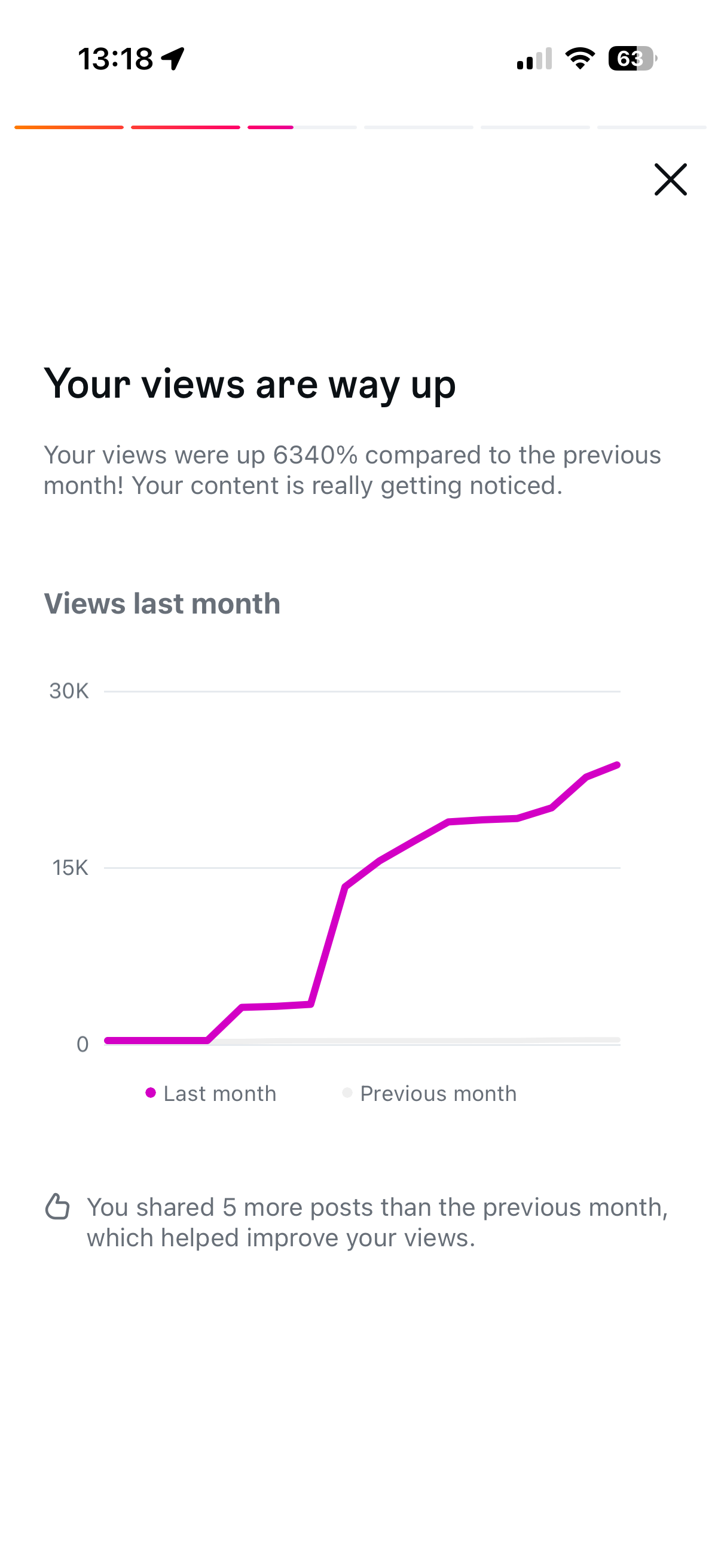
The branding was landing with their people, and finding new ones too...
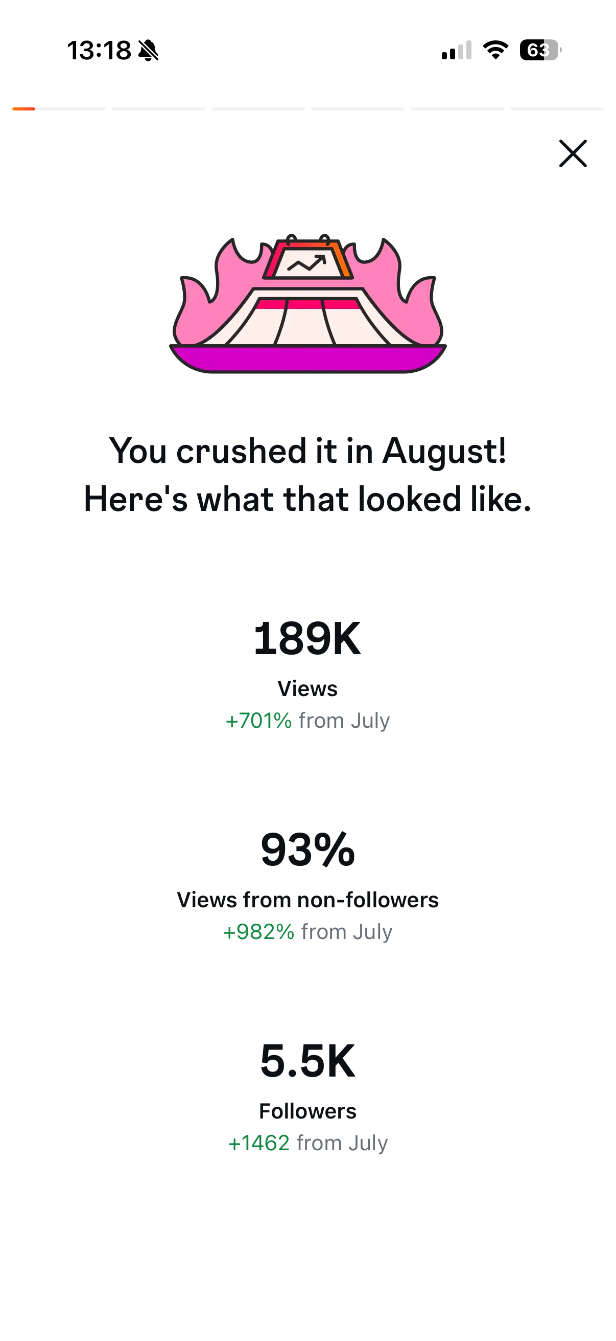
And it just kept building
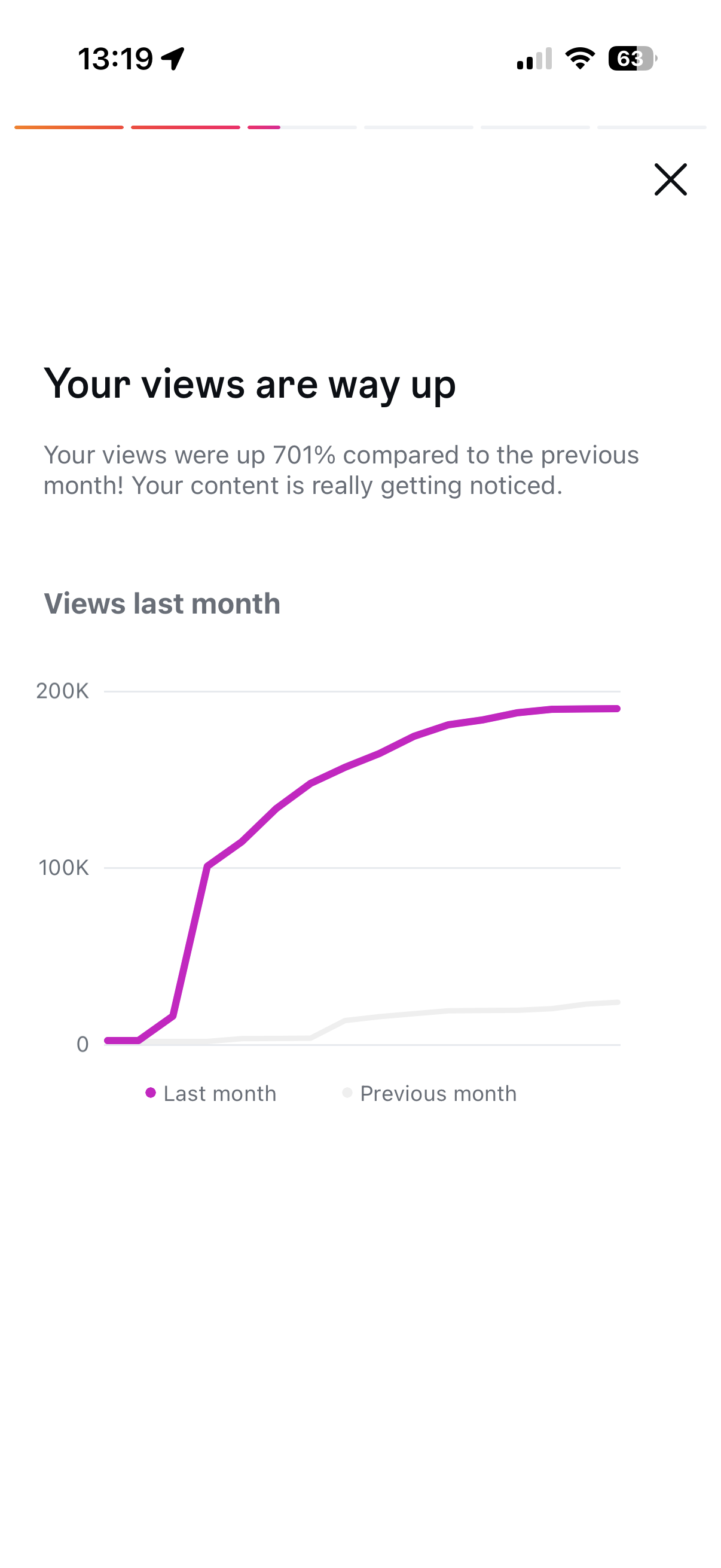
Seeing 200k views in August, 2 months after the rebrand!